You are on our International website. Please select your region to see content specific for your location


LATEST BLOGS
2026 Entryway Decor Color Ideas That Boost Space Perception
- 23 January 2026
- 4 Min Read
- By Jaipur Rugs
In 2026, designers are using entryway color codes to quietly manipulate space perception, making homes feel larger, calmer, and more intentional. These aren’t trends or palettes. They’re psychological tools. Once you understand them, you’ll never see an entryway or your own home the same way again. Keep reading to know why.
In 2026, entryways are no longer treated as leftover space. They are now perceptual thresholds, zones that decide how large a home feels, how calm it reads, and how the body transitions from outside chaos to interior control. Color is doing the heavy lifting. Not as decoration, but as spatial code.
This is why entryway decor color codes have become one of the most searched and discussed interior strategies globally. Designers are no longer asking what color looks good. They are asking what color makes this space feel bigger, clearer, and more intentional. The answers are rooted in psychology, perception science, and how homes are actually lived in today.
What Do Entryway Decor Color Codes Mean in Modern Design?
Entryway decor color codes are intentional color systems used to control spatial perception, emotional response, and visual flow at the home’s threshold.
These codes exist because the brain processes color before form. In an entryway, that split-second interpretation determines whether the space feels open or compressed, calm or overstimulating.
Entryway decor color codes work because they:
-
Guide the eye forward instead of stopping it at walls.
-
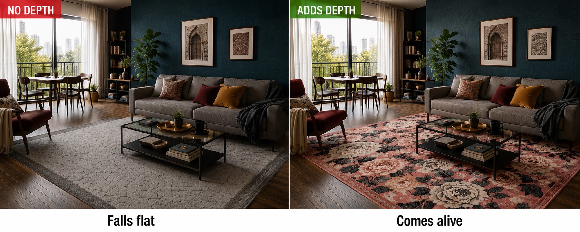
Reduce visual noise in transition zones with handmade rugs.
-
Establish continuity with adjacent spaces via runner rugs.
-
Signal emotional tone before furniture is noticed.
In 2026, this logic defines entryway decor trends 2026 across residential design, from compact apartments to expansive villas.
How Does Entryway Color Psychology Shape Space Perception?
Entryway color psychology explains how color alters the brain’s perception of depth, width, and emotional safety.
This is the foundation of modern space perception decor.
Color does not behave neutrally. It advances, recedes, softens, or sharpens space depending on tone, saturation, and finish.
Here’s how entryway color psychology works in practice:
-
Cooler, muted hues visually push walls back, expanding narrow entryways.
-
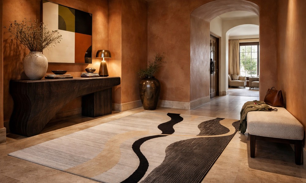
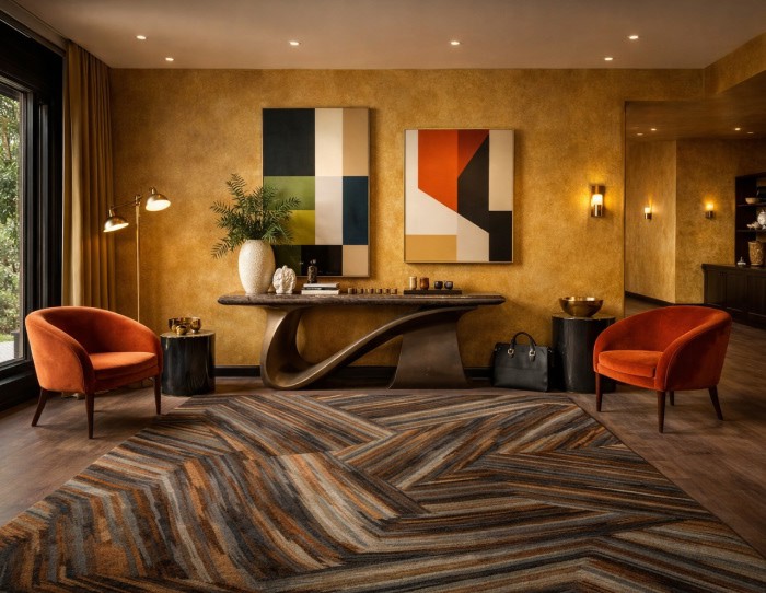
Warm mineral tones ground larger spaces without closing them in.
-
Low-saturation colors reduce stress at the point of arrival.
-
Matte and textured finishes prevent glare, keeping perception calm.
This is why entryway color psychology is now treated as spatial science, not aesthetic theory.
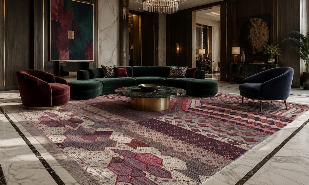
Why Do Entryway Color Schemes Matter More in 2026 Interiors?
Entryway color schemes matter in 2026 because entryways now manage emotional transition, not just circulation.
Homes carry more cognitive weight than ever, and the entryway absorbs it first.
With remote work, wellness-focused interiors, and open-plan living, the threshold must regulate energy. The wrong color compresses space and overwhelms the senses. The right one creates immediate orientation.
Modern entryway color schemes succeed when they:
-
Create visual continuity instead of abrupt contrast.
-
Balance warmth with restraint.
-
Support spatial flow into living areas.
-
Reduce mental friction at entry.
This is why entryway decor trends 2026 prioritize perceptual clarity over visual drama.
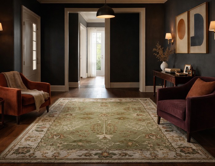
What Color Strategies Work Best for Narrow Vs Wide Entryways?
The best color strategies depend on whether an entryway needs expansion or definition.
One size does not fit all in space perception decor.
For narrow or enclosed entryways:
-
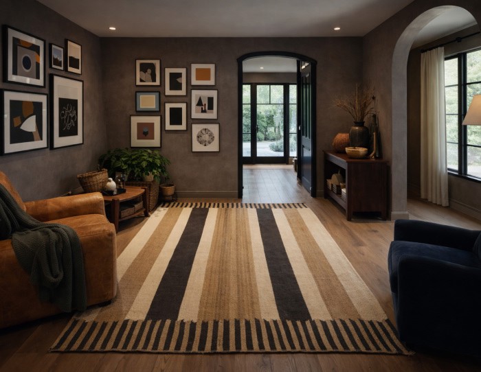
Use mid-light neutral tones to extend walls visually.
-
Keep ceilings close in color to walls for vertical continuity.
-
Avoid sharp color breaks at door frames.
-
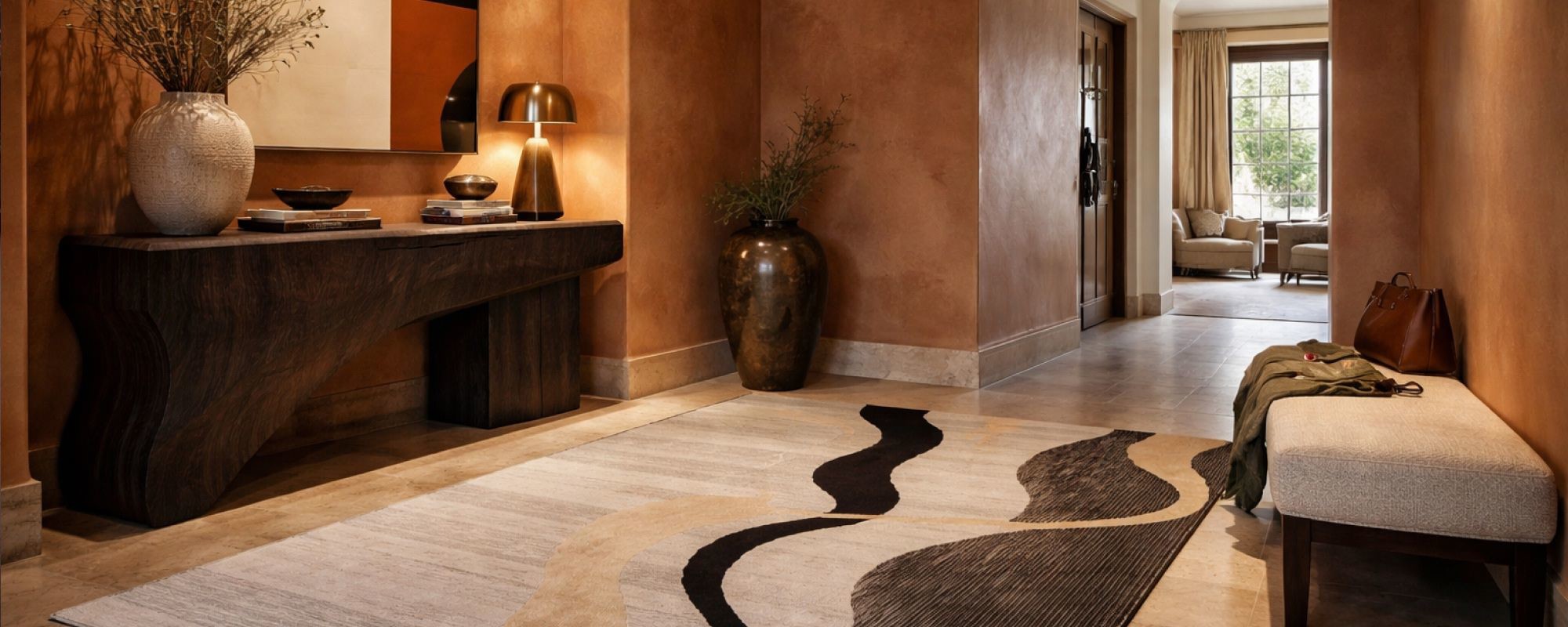
Try out pastel rug entryway ideas that reduce visual interruption.
For wide or open entryways:
-
Introduce grounded base tones to prevent spatial drift.
-
Use controlled contrast to define the threshold zone.
-
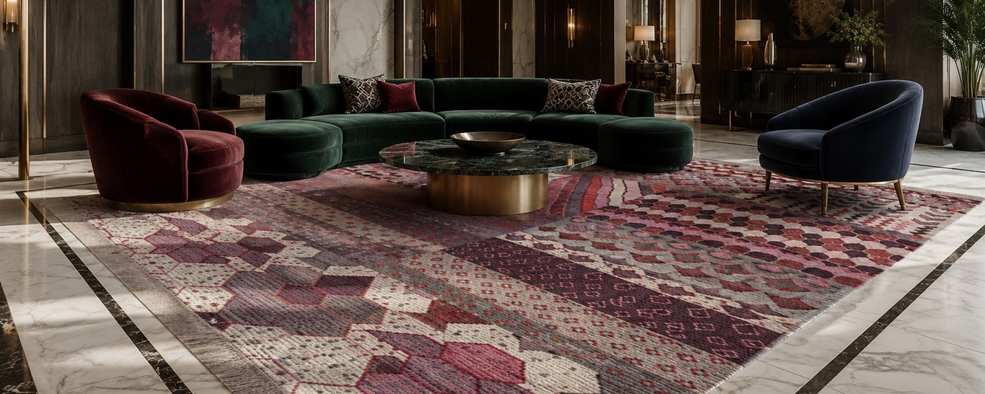
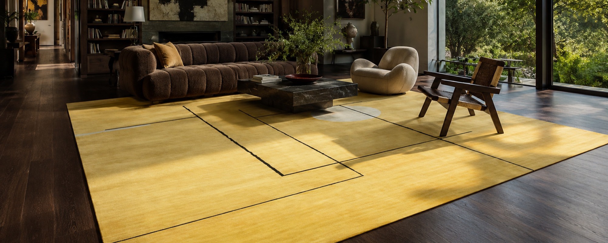
Anchor the floor visually with darker or textured wool rugs.
-
Let entryway color schemes establish hierarchy, not decoration.
These strategies ensure the space feels intentional, not accidental.
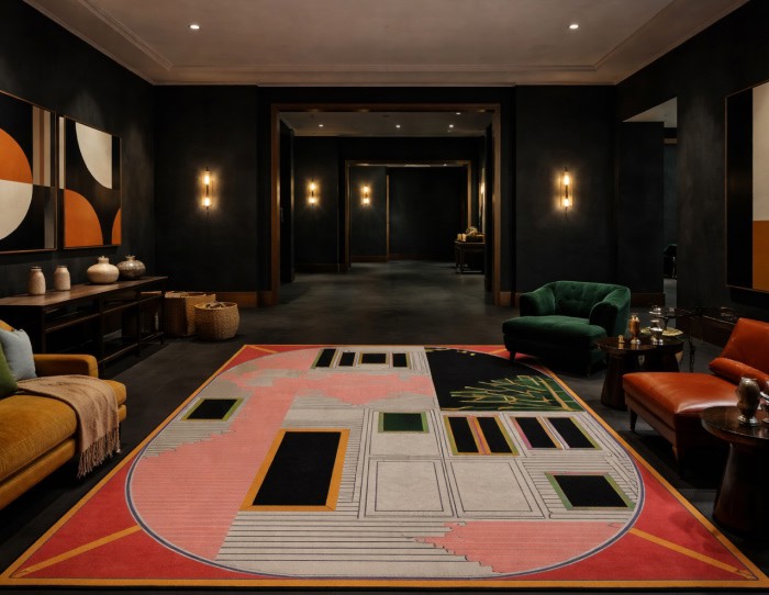
How Do Rugs, Wall Art, & Tapestries Reinforce Entryway Color Codes?
Soft furnishings are not accessories; they are structural tools within entryway decor color codes.
They translate color theory into physical experience.
Designer rug styling for entryway areas works because:
-
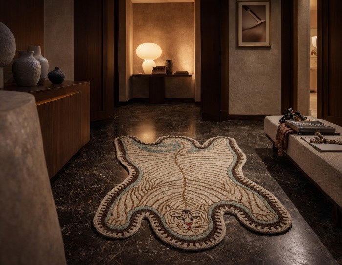
Hand knotted rugs anchor the dominant color at floor level.
-
Texture affects light absorption, enhancing depth.
-
The correct scale prevents visual fragmentation.
-
Subtle geometric rug pattern supports movement rather than distracting it.
Wall art for entryway spaces strengthens perception by:
-
Activating vertical planes without closing space.
-
Echoing or balancing the primary color code.
-
Creating rhythm instead of focal overload.
Tapestry entryway decor adds:
-
They provide acoustic softness.
-
Strongly supports vertical continuity.
-
Enhances material depth without visual heaviness.
Throws and carpet accents act as connectors by:
-
Bridging color transitions between rooms.
-
Adding warmth without breaking the palette.
-
Supporting layered, human-centered design.
Together, these elements make space perception decor feel lived-in, not staged.
Summing Up..
In 2026, the most effective interiors don’t shout. They guide. Entryways, once overlooked, now carry disproportionate influence over how space is perceived and how people feel inside their homes.
By understanding and applying entryway decor color codes, designers create spaces that feel larger, calmer, and more intentional.
And that’s the real shift: entryways are no longer entrances. They are perceptual negotiations, and color is the language doing the talking.
We will be back with another blog soon.
Till then, stay tuned and explore Jaipur Rugs!
FAQs
What colors make a small entryway look bigger in 2026?
Light neutrals like warm whites, soft greige, pale taupe, and muted sand reflect more light and visually expand entryway spaces in 2026.
Which entryway decor colors improve first impressions?
Balanced tones such as warm beige, clay neutrals, sage green, and soft charcoal create a welcoming, elevated first impression without overwhelming the space.
Are dark colors bad for entryway decor?
No. Dark colors like deep olive, charcoal, or ink blue work well in entryway decor when balanced with good lighting, mirrors, and lighter flooring.
What is the best color combination for modern entryway ideas?
Modern entryway ideas favor two-tone palettes: light walls paired with darker doors, benches, or rugs to add depth while keeping the space open.
How does color affect space perception in entryway design?
Lighter colors visually push walls outward, while mid-tones ground the space. Strategic contrast guides the eye and improves spatial clarity.


Pic Credits
Jaipur rugs / Abil Dase
Share
-
 Facebook
-
 Twitter
-
 Email
Email
Related posts
-
22 June 2026
-
6 Min Read
Why Top Interior Designers are Switching to Indian Handmade Rugs
High-end interior designers have begun using handmade carpets from India in place of machine-made carpets to enhance their design portfolios and ensure product longevity. The following guide will help you understand why design professionals prefer Jaipur Rugs for creating customized, ethically produced wool-and-bamboo-silk carpet designs for luxurious homes.
Read More >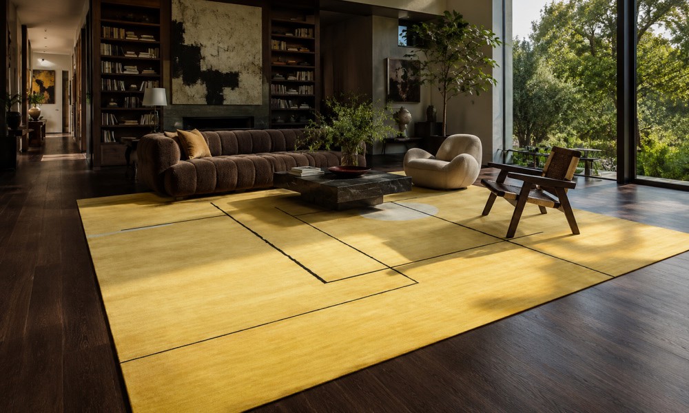
-
20 June 2026
-
8 Min Read
Contrast is Everything: The Best Rugs for Dark Wood Floors
A dark wood floor immediately adds elegance to any home interior, yet darker shades can absorb all natural light from outside and will “eat” any furniture that is not properly buffered. In this detailed guide, we are going to look at how to pick the right rugs for wood floors, considering color balance, light neutrals, texture, and size.
Read More >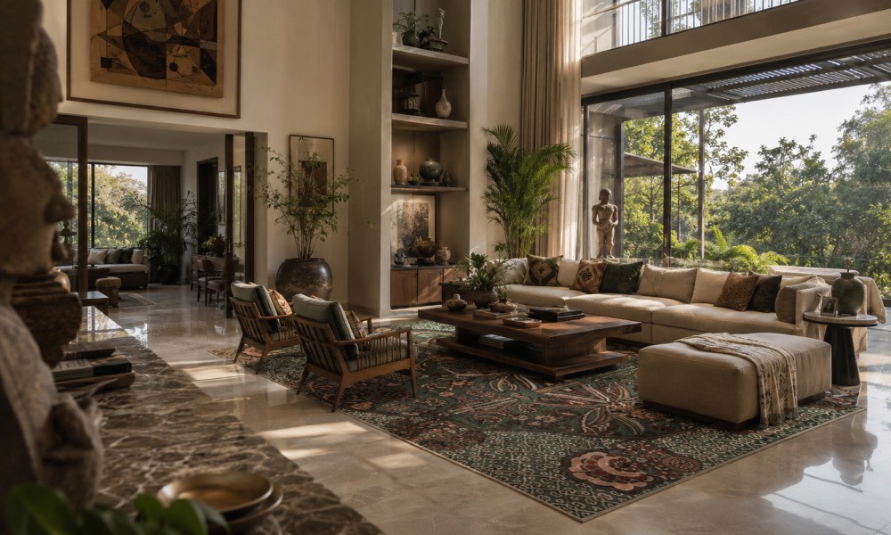
-
19 June 2026
-
11 Min Read
What Vastu Colours for Living Room Rugs Are Best? A Complete Directional Guide
Selecting the right vastu colors for living room rugs anchors your home layout with balance. This directional guide details the best shades for North, East, South, and West quadrants. Align your luxury decor with classic principles and shop premium hand-knotted, traditional, or custom accent rugs to perfectly match your home setup.
Read More >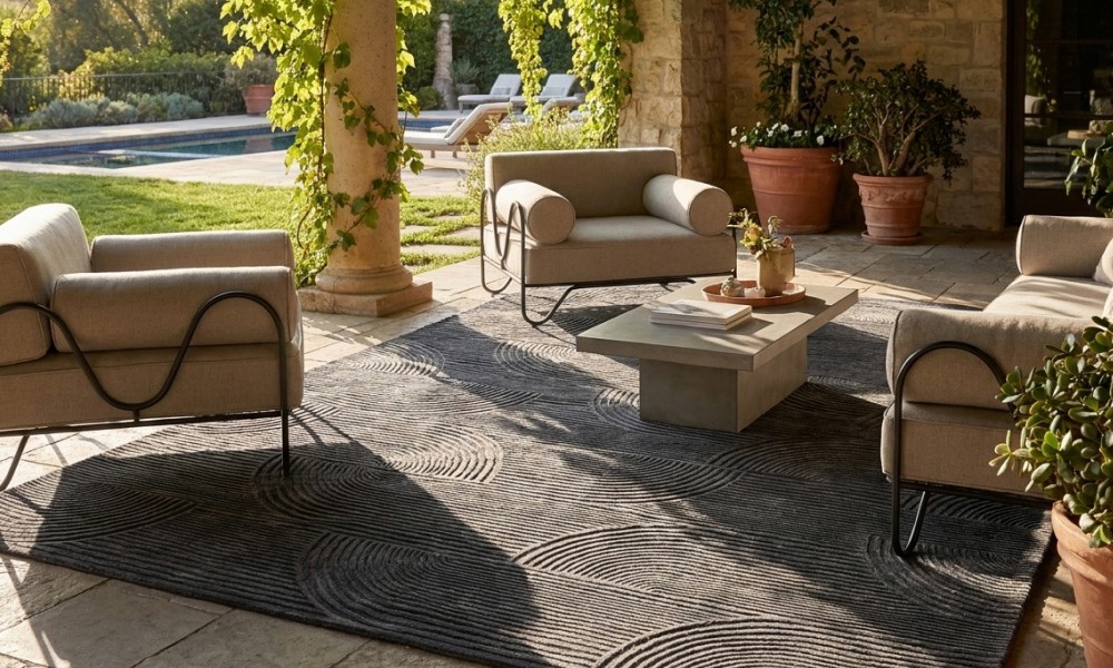
-
17 June 2026
-
5 Min Read
Why Most Patios Feel Incomplete Until You Add a 10x14 Outdoor Rug
Most people assume their patio feels incomplete because they need more furniture. That's usually not true. In many cases, the real issue is scale, not seating. Before spending thousands on another chair, sofa, or dining set, discover why a properly sized Outdoor Rug 10x14 can completely change how your patio looks, feels, and functions.
Read More >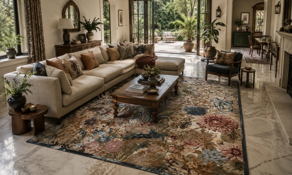
-
12 June 2026
-
10 Min Read
Master the Art of Indian Home Decor: Choosing the Best Rugs for Marble Floors
Polished marble floors add undeniable luxury to Indian homes but require strategic styling to manage cold surfaces and acoustics. This guide details how to choose premium wool, silk, and cotton rugs that complement light or dark stone. It also explains the absolute necessity of using high-quality, stone-safe non-slip rug pads to prevent dangerous slips and avoid floor discoloration.
Read More >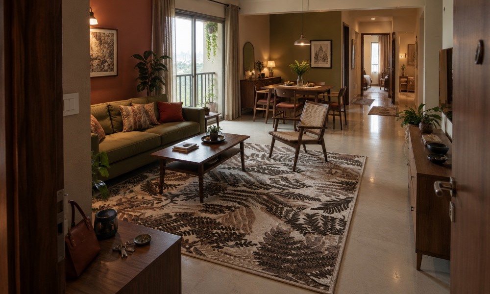
-
10 June 2026
-
8 Min Read
The Ultimate Guide to Choosing the Perfect Rug for Your New 3BHK Apartment
Choosing the right rugs for a new 3BHK apartment involves balancing room functionality with style. This expert guide explains how to select high-quality hand-knotted, flat-weave, and soundproof rugs, room by room. Learn optimal sizing, premium material selection, and maintenance tips to effortlessly zone your living, dining, and bedroom spaces while elevating your home's luxury, comfort, and acoustic privacy.
Read More >