You are on our International website. Please select your region to see content specific for your location





 Profile
 Orders
 Wishlist
 Change Password
 Logout


LATEST BLOGS
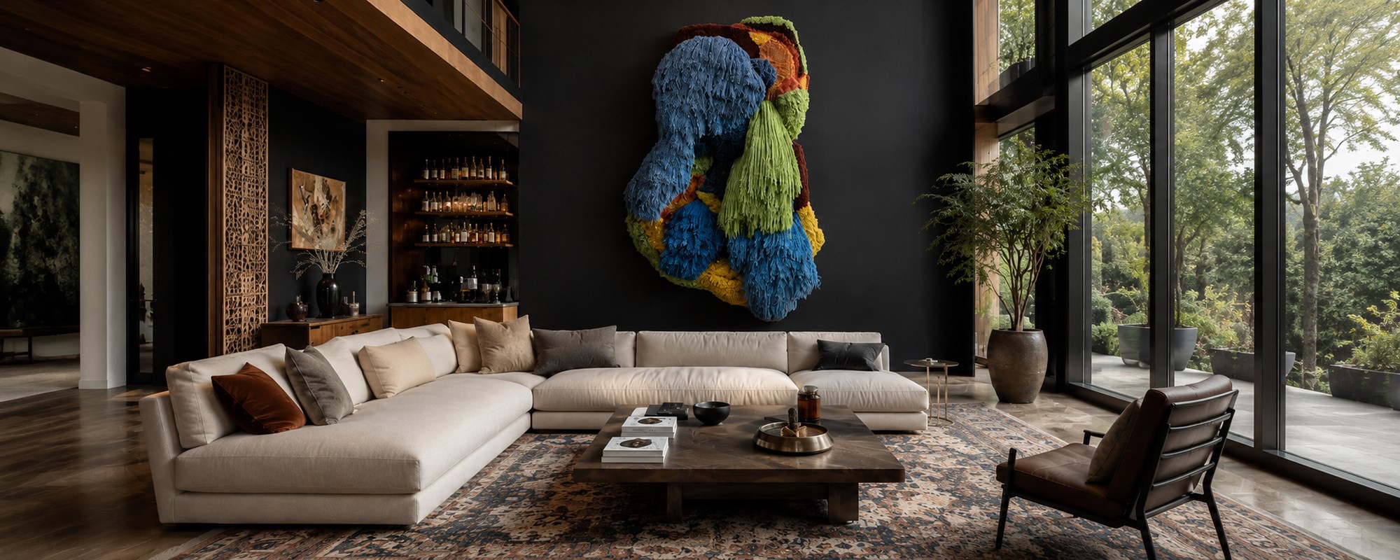
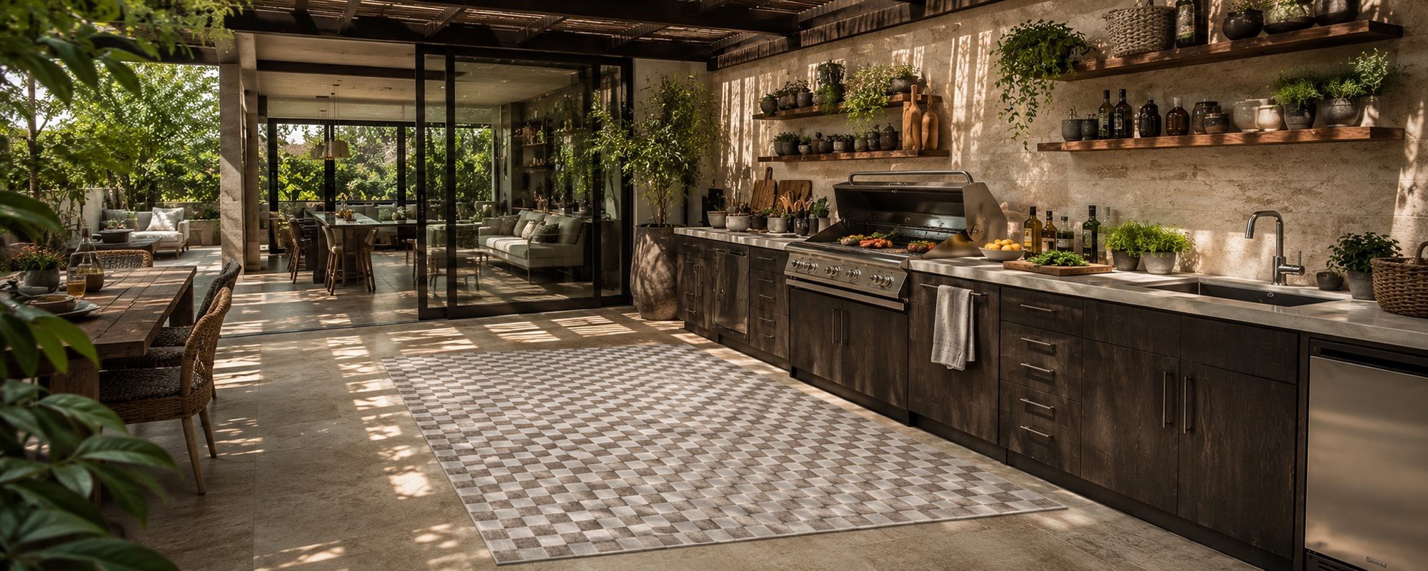
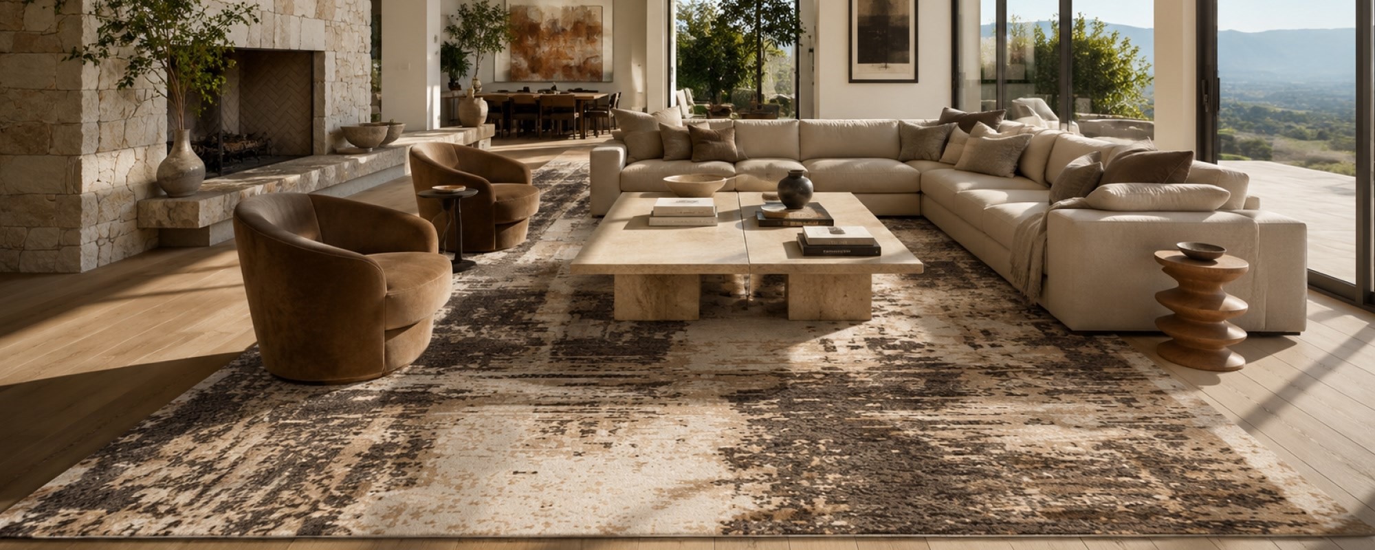
Analogous Color Scheme 101: The Lazy Genius’s Guide to a Designer Interior
- 14 May 2025
- 5 Min Read
- By Jaipur Rugs
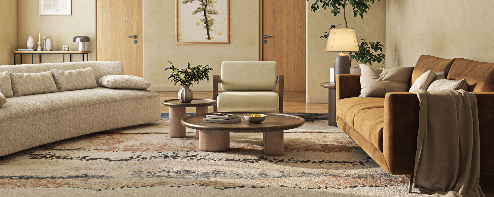
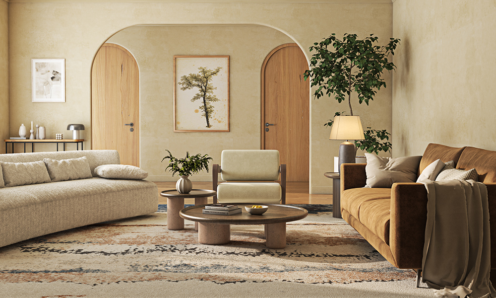
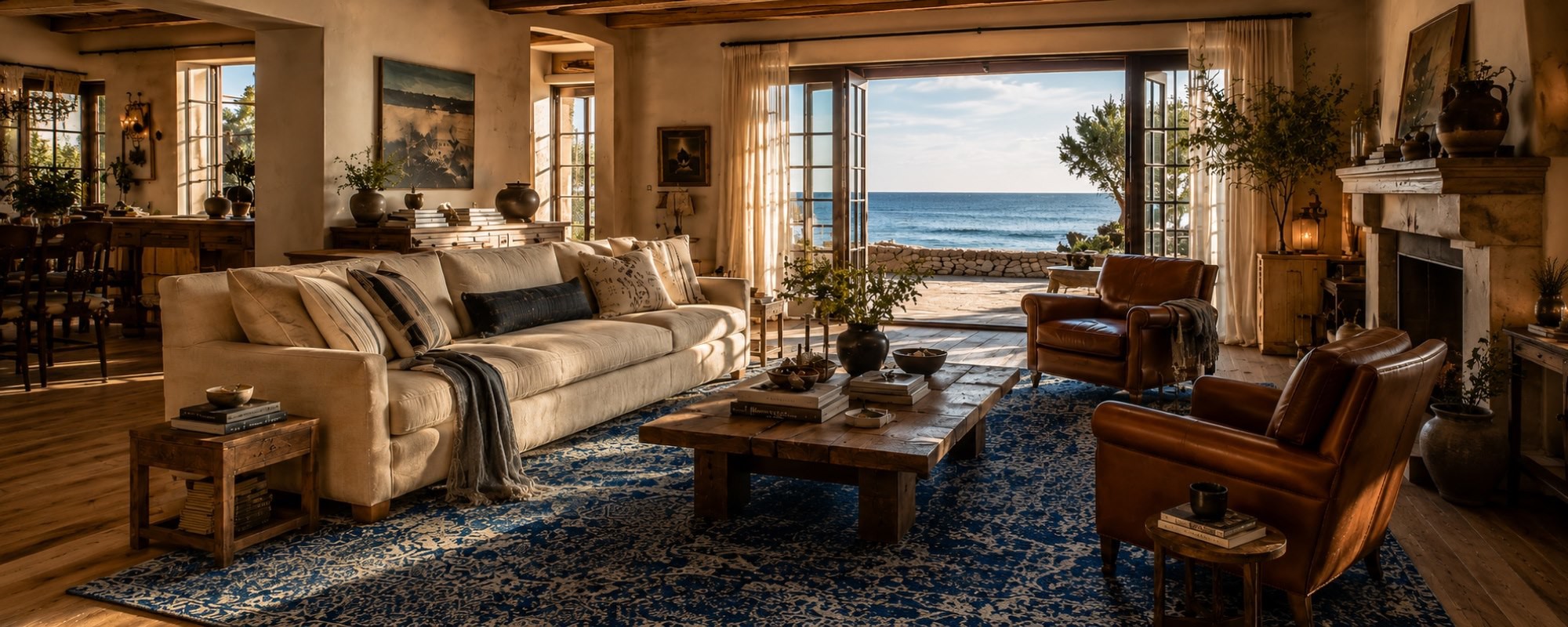
Color theory sounds dull—until it makes your living room look like a boutique hotel. Analogous color schemes are the low-effort, high-impact cheat code designers swear by. No stress. No clashes. Just flawless flow. Ready to create a space that’s more luxuriously on point & believable than your ex’s excuses? Let’s do this, Lazy Genius.
Interior designing & decorating can feel like a wild jungle of decisions. Color palettes, textures, themes, lighting, mood boards... exhausting, right?
But what if we told you there’s one little color trick that interior designers use to create rooms that just work—without spending three weeks decoding the color wheel?
Entering the analogous color scheme. It’s like the “effortlessly stylish” friend who throws on a linen shirt and somehow looks like a Milan runway model. So if you want your home to look pulled-together, calming, and Pinterest-worthy without spiraling into a color panic—keep reading.
What Exactly Is an Analogous Color Scheme? And Why Should You Care?
Let’s break it down—no jargon, just vibes.
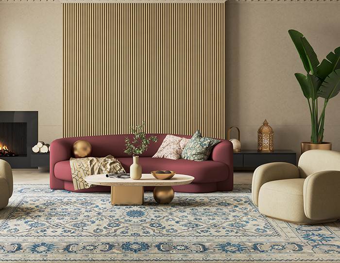
An analogous color scheme comprises three (or more) colors that sit next to each other on the color wheel. Think: blue, blue-green, and green. Or red, red-orange, and orange. They are basically next-door neighbors on the color wheel, and they get along like a house on fire.
Why does this matter? Because analogous colors have a natural harmony. They look like they belong together—because they do. Your eye doesn’t have to work hard to process them, which makes any space feel instantly calm, cohesive, and designer-level intentional. Now you know why interior designers gatekeep such secrets, cause creating a photoshoot-worthy interior ain't got to do much with fancy products but on-point decor eye.
Imagine the soothing flow of a sunset palette—gold, amber, coral. Or a coastal dream of navy, teal, and seafoam. That’s analogous magic in action.
The Colour Wheel Is Your Wingman - Here’s How to Use It
Now, don’t panic. You don’t need an art degree to understand the color wheel. All you need is this simple trick:
-
Pick your base color (the one you love most)
-
Look to the left and right of it on the color wheel
-
Boom: You have got your analogous colours
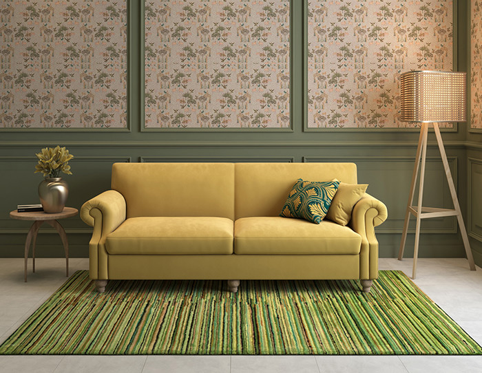
Let’s say you’re obsessed with green (hello, olive couch). Its neighbors are yellow-green and blue-green. So, think mossy walls, sage accents, and maybe a hint of teal in a Persian rug or sheer curtain. Pure chef’s kiss, such a view would be.
Pro Tip: The closer the hues, the more subtle and soothing the palette. Want more contrast and energy? Space them out slightly—but don’t stray too far or you will slide into complementary territory (which is a whole other drama).
Analogous Color Scheme in Interior Design
Okay, time to get your hands metaphorically dirty.
Living Room
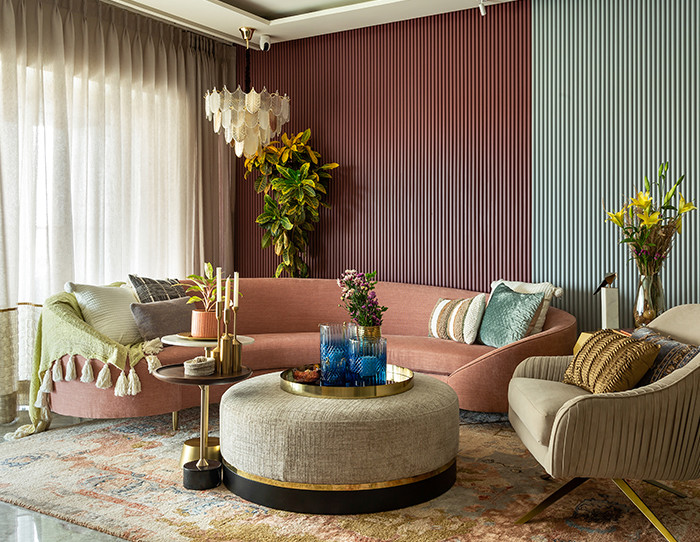
A calm retreat with blue, blue-green, and green—think a navy sofa, teal armchair, and forest green round rugs. Layer textures, keep accessories in the same tone family, and toss in gold hardware for warmth.
Bedroom
Romance the room with red, red-orange, and orange. Burnt sienna walls, terracotta linen, rust-colored runners, or bedside rugs—hello, creamy soft dreamland.
Kitchen
Want fresh and light? Try yellow, yellow-green, and green. Sage cabinets, lemon-toned bar stools, and olive pottery = instant Mediterranean brunch vibes.
The beauty? You can go bold or muted depending on your vibe. Analogous colours don’t mean boring—it means controlled drama.
The Science Behind Why Analogous Colors Feel So Right
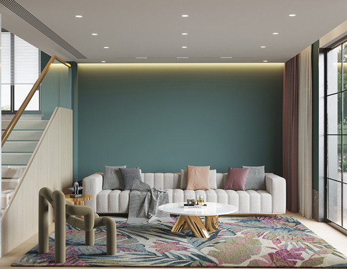
Here’s the geeky-good part: our brains love patterns, and analogous schemes hit all the right neurological notes.
Colors that sit close to each other on the wheel share similar wavelengths, which means our visual cortex processes them smoothly—like a slow jam for your eyes. No clashes, no tension. Just harmony.
And there’s even emotional science involved. Analogous palettes often evoke a unified mood. Warm tones (reds, oranges, yellows) feel cozy and energizing. Cool tones (blues, greens, purples) bring a sense of calm, clarity, and freshness.
It’s no wonder luxury hotels, spas, and high-end interiors lean into these schemes. They are the design equivalent of a deep exhale.
Common Mistakes and How to Avoid Them?
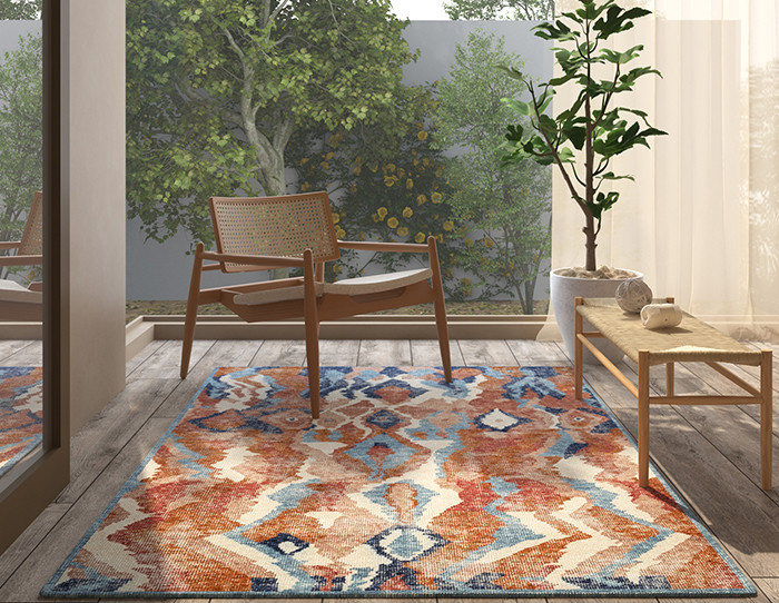
Even lazy geniuses make mistakes. Here's how to dodge them:
Mistake 1: Going Too Matchy-Matchy
If your sofa, walls, curtains, and cat are all the exact same shade—sir/ma'am, we have a monotony problem. Mix tones, add texture, and balance with neutrals.
Mistake 2: Forgetting Contrast
Yes, it’s all about harmony, but you still need a bit of drama. Use contrast in texture (think velvet vs jute), materials (marble, metal, silk), or saturation (muted walls with bold cushions).
Mistake 3: Ignoring Neutrals
Neutrals are your palette cleansers. White, beige, soft grey—they give your analogous colors space to shine without feeling overwhelming.
How to Build a Perfect Analogous Color Scheme?

Let’s simplify this:
-
Pick your hero hue – What color are you obsessed with? Start there.
-
Find its neighbors – Check the color wheel. Add one or two next to it.
-
Choose your vibe – Want a spa? Go cool. Want a cocoon? Go warm.
-
Balance it out – Add neutrals. Vary light and dark shades.
-
Layer textures and tones – Linen, velvet, wood, metals—it’s not just about color, it’s about feel.
Still unsure? Start small—maybe with an analogous modern rug, art piece, or throw pillows.
Summing Up..
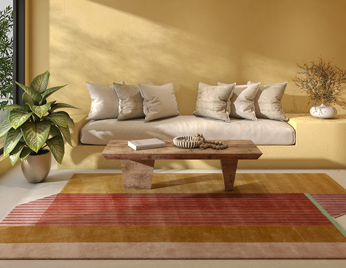
If you have made it this far, congrats—you now know more about analogous color schemes than most people do (even the ones with Pinterest mood boards called “Scandi Chic But Make It Warm”).
Here’s the thing: you don’t need to be a color theorist or interior stylist to make your space sing. You just need to pick three BFF colors sitting next to each other, add some personality, and let the palette do its magic.
So, whether designing your dreamy Dubai villa or styling a cozy apartment nook in NY, go forth and color like the lazy genius you are.
Because when your colors flow, your home glows.
We will be back with another exciting blog soon!
Till then, stay tuned and explore Jaipur Rugs.
FAQs
What is an analogous color scheme?
An analogous color scheme uses colors that are next to each other on the color wheel.
Is analogous 3 or 4 colors?
Typically, it includes 3 colors, but sometimes 4 can be used for variation.
What is an analogous color scheme emotion?
It often creates a harmonious, calming, and cohesive emotional effect.
What are the characteristics of analogous colors?
They share a common hue, have low contrast, and blend well together.
What is an analogous color in interior design?
It refers to using adjacent colors to create a serene and visually unified space.
What is an example of an analogous color scheme?
Blue, blue-green, and green are a classic example.
What is the difference between analogous and complementary colors?
Analogous colors sit side by side on the color wheel; complementary colors are opposite each other and offer high contrast.
Are analogous colors warm or cool?
They can be either warm or cool, depending on the section of the color wheel used.


Pic Credits
Jaipur rugs / Abil Dase
Share
-
 Facebook
-
 Twitter
-
 Email
Email
Related posts
-
10 July 2026
-
10 Min Read
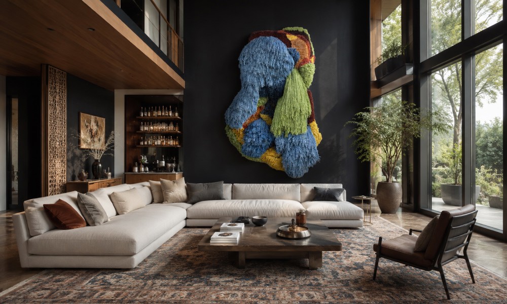
How to Pair Indian Wall Art with the Right Rug Pattern: A Room-by-Room Guide
Choosing the right rug to go with your Indian wall art does not have to be guesswork. This guide breaks it down room by room, from the living room to the bathroom and outdoor spaces. Learn how to match colors, patterns, and scale so your wall art and rug always feel like they belong together.
Read More >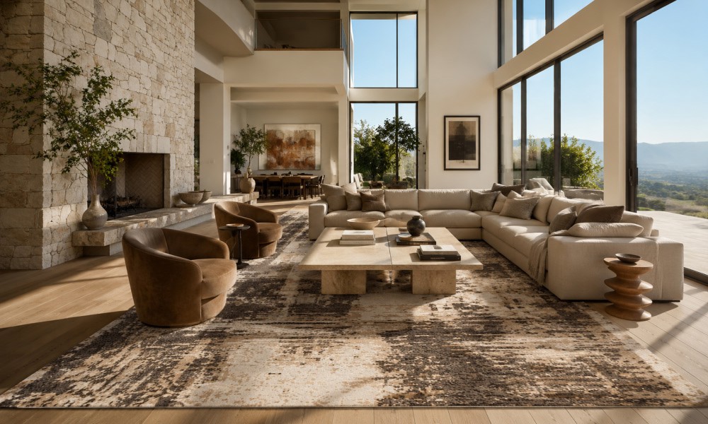
-
07 July 2026
-
9 Min Read
How to Tell If a Rug Is Handmade: 7 Signs Experts Look For (Abrash Is One of Them)
Wondering how to know if a rug is handmade? Get an overview of 7 key characteristics that will help you identify if a rug is truly handmade and learn about its differences compared to machine-made rugs, and why they do not lose their value. Here is what to keep in mind when buying a handmade rug.
Read More >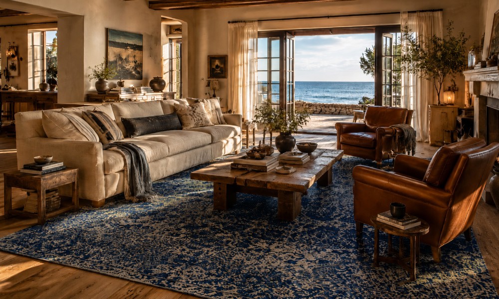
-
04 July 2026
-
8 Min Read
Coastal Grandmother Is Evolving: The 2026 "Coastal Heritage" Aesthetic and the Rugs That Define It
The coastal grandmother design is progressing into something new and exciting by 2026. Coastal Heritage introduces texture, craftsmanship, and handmade elements to this popular design style. Here are the various rug types, colors, and decorating ideas to know about this classic coastal design trend.
Read More >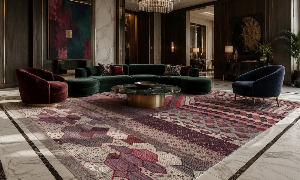
-
22 June 2026
-
6 Min Read
Why Top Interior Designers are Switching to Indian Handmade Rugs
High-end interior designers have begun using handmade carpets from India in place of machine-made carpets to enhance their design portfolios and ensure product longevity. The following guide will help you understand why design professionals prefer Jaipur Rugs for creating customized, ethically produced wool-and-bamboo-silk carpet designs for luxurious homes.
Read More >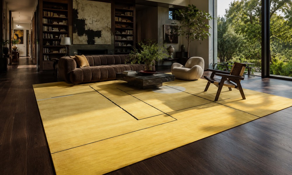
-
20 June 2026
-
8 Min Read
Contrast is Everything: The Best Rugs for Dark Wood Floors
A dark wood floor immediately adds elegance to any home interior, yet darker shades can absorb all natural light from outside and will “eat” any furniture that is not properly buffered. In this detailed guide, we are going to look at how to pick the right rugs for wood floors, considering color balance, light neutrals, texture, and size.
Read More >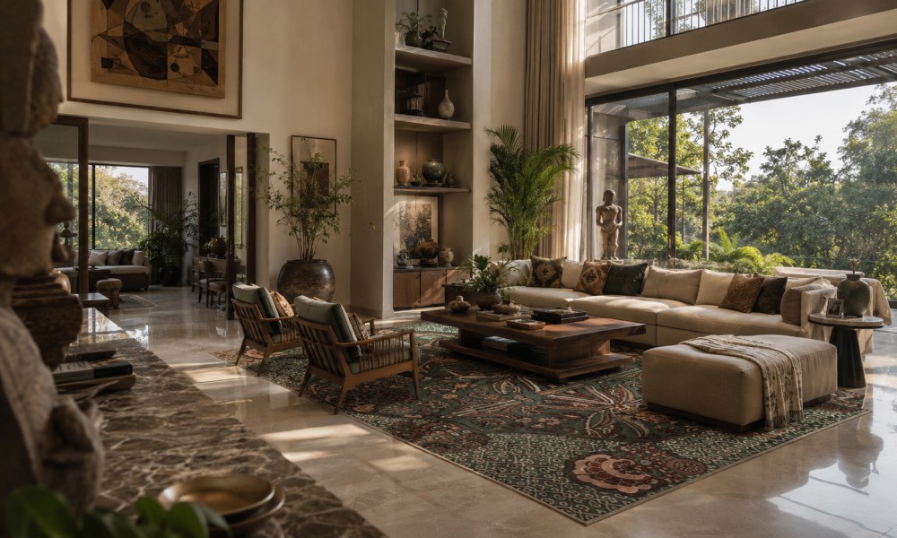
-
19 June 2026
-
11 Min Read
What Vastu Colours for Living Room Rugs Are Best? A Complete Directional Guide
Selecting the right vastu colors for living room rugs anchors your home layout with balance. This directional guide details the best shades for North, East, South, and West quadrants. Align your luxury decor with classic principles and shop premium hand-knotted, traditional, or custom accent rugs to perfectly match your home setup.
Read More >