You are on our International website. Please select your region to see content specific for your location




 Living Room
 Dining Room
 Bedroom
 Kids Room
 Outdoor
 Irregular
 Runner
 Hand Knotted
 Hand Tufted
 Hand Loom
 Flat Weaves
 Shag
 Modern
 Transitional
 Traditional
 Minimalist
 Bohemian
 Eclectic
 Maximalist
 Monochromatic
 Neutrals
 Pastels
 Vibrant
 Abstract
 Oriental
 Moroccan
 Distressed
 Floral
 Geometric
 Graphic
 Solid
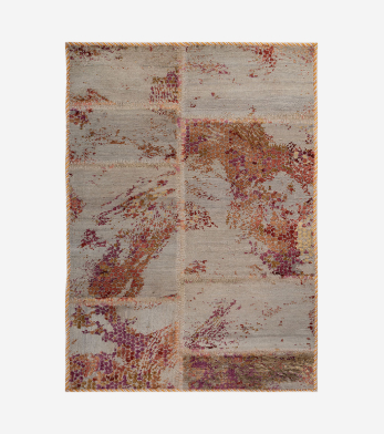 Patchwork
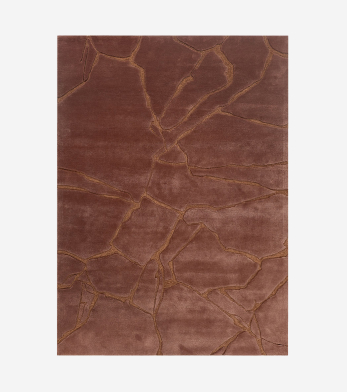 Genesis
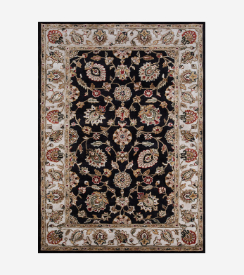 Kasbah
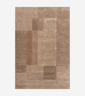 Cera
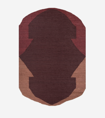 Daaira
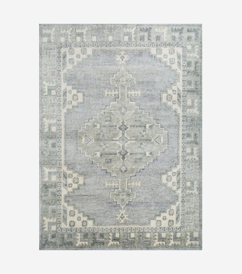 Savana
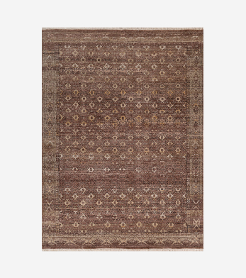 Someplace In Time
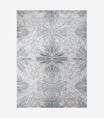 Chaos Theory By Kavi
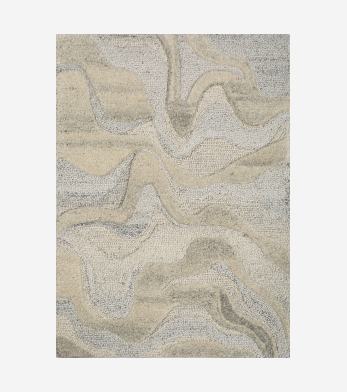 Pathways
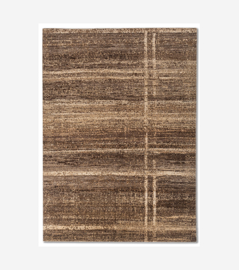 Manifest
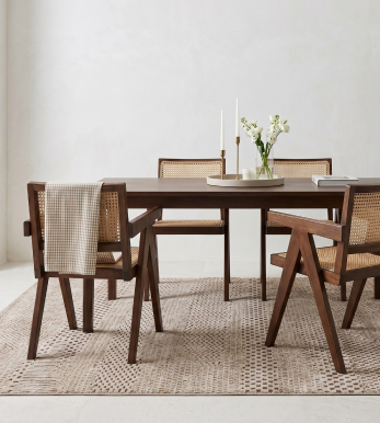
 Kengo Kuma
 VIMAR 1991
 Bodour Al Qasimi
 Richard Hutten
 Peter D'ascoli
 Vinita Chaitanya
 Tatiana De Nicolay
 Keith Pillow
 Kunaal Kyhaan Seolekar
 Pavitra Rajaram
 Ashiesh Shah
 Matteo Cibic
 Tania & Sandeep Khosla
 Gauri Khan
 Abin Chaudhuri
 Kavi
 Gabriel Hafner NEW
 Neeraj Patel
 Princess Pea
 Gurjeet Singh
 Lorenzo Vitturi
 Rug Warranty
 Stain Resistance
 Track Order
 The Founder
 The Company
 The Craft
 Sustainability
 Hospitality
 Retail
 Aviation
 Yacht
 Residential
 View all
 Stores
 My Account

 Trade
 Email Us
 Contact Us
 WhatsApp Chat
 Book Appointment
 Track Order


 Profile
 Orders
 Wishlist
 Change Password
 Logout


Latest Blogs
ideas and inspiration
Monochromatic Color Scheme: How to Design a One-Color Room That Never Feels Flat
- 28 October 2026
- |
- 11 Min Read
- |
- By Jaipur Rugs
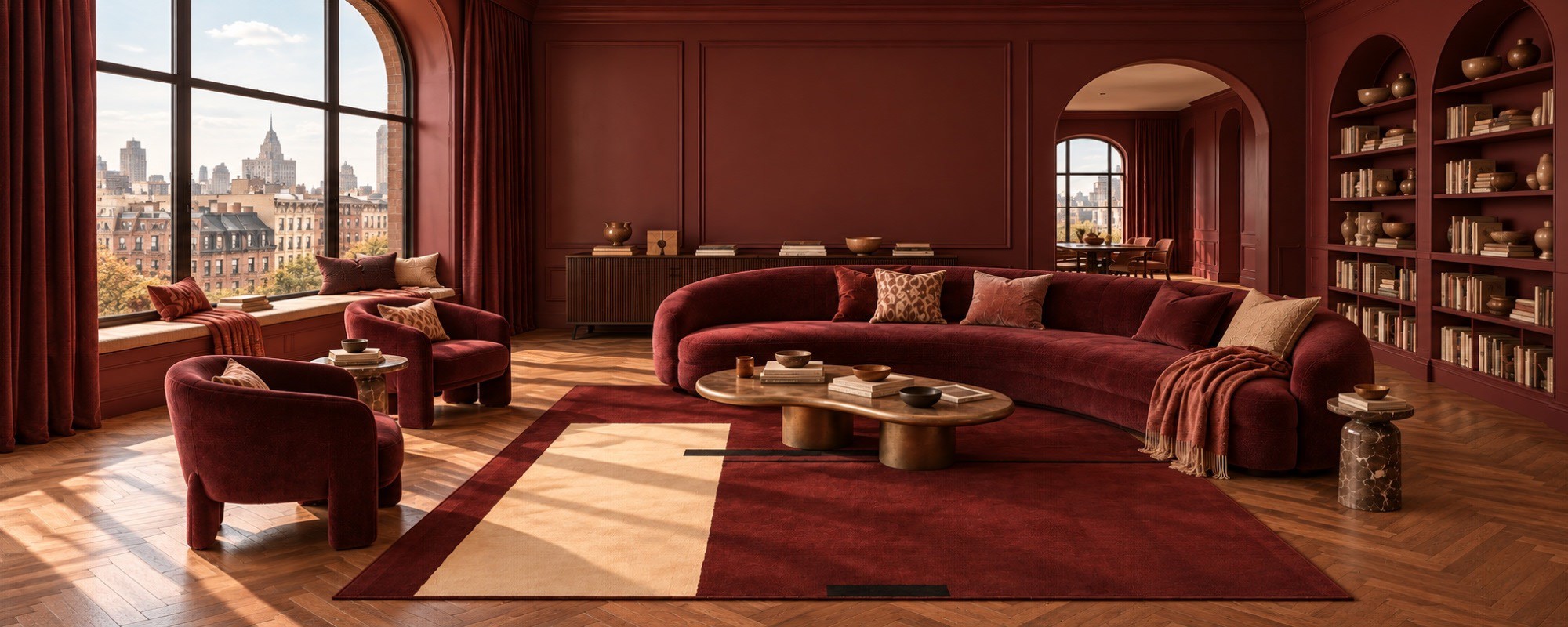
A monochromatic color scheme uses different shades, tints and tones of one colour to create a cohesive interior. Learn how to style monochromatic living rooms, bedrooms and kitchens using colour, texture, furniture and rugs. Explore monochromatic colour scheme examples, understand the difference between monochromatic design and colour drenching, and find practical ideas for creating balanced, visually interesting spaces in modern homes.
A room built around one colour can feel rich, expressive and full of personality when its shades, textures and furnishings work together. A monochromatic color scheme uses variations of a single colour to create a cohesive interior, from dramatic burgundy living rooms to soft lavender bedrooms and layered forest green spaces.
The secret is not to make everything look identical. Instead, combine lighter and darker shades, contrasting materials and carefully chosen furniture to give the room depth. Rugs play an important role, too, adding texture and helping define the space without introducing an entirely different colour palette.
Whether you prefer bold, saturated interiors or softer, understated rooms, monochromatic interior design offers a flexible way to create a home that feels considered without looking overly coordinated.
What is a Monochromatic Color Scheme?
A monochromatic color scheme is an interior design approach that uses one base colour and its different tints, tones, and shades. Tints are created by adding white, shades by adding black, and tones by adding grey. These variations allow a room to feel layered even when the dominant colour remains consistent.
For example, a burgundy room might feature wine-coloured walls, a deeper oxblood sofa, and muted rose accents. Similarly, a forest green living room could combine dark green upholstery, softer green walls and olive-toned accessories.
What are Monochromatic Colors?
Monochromatic colors are variations of the same hue rather than completely different colours. They can range from pale and subtle to deep and dramatic, depending on how much white, black or grey is introduced.
This is what makes a monochromatic color palette useful in interior design. You can create contrast without relying on several unrelated colours. Differences in texture, light, and material do much of the visual work.
Monochromatic Color Scheme Interior Design: The Elements That Make It Work
A successful monochromatic color scheme interior design approach needs more than matching walls and furniture. The aim is to create a balance between colour, contrast, texture and proportion.
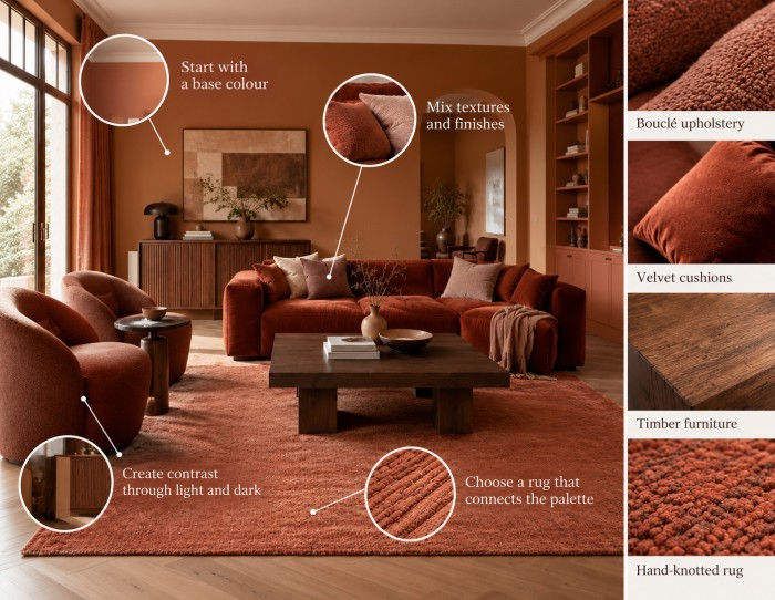
Start with a Base Colour
Choose a colour that suits the room’s natural light, architecture and intended mood. Forest green and chocolate brown can make larger living spaces feel enveloping, while lavender and sage offer a softer approach. Cobalt blue creates a more energetic atmosphere, and terracotta adds warmth.
Before committing, test the colour in different parts of the room. A shade can look noticeably different in direct sunlight, indirect daylight, and shadow.
Mix Textures and Finishes
Texture is one of the most effective ways to prevent a monochromatic room from feeling flat. Pair smooth painted walls with bouclé upholstery, velvet cushions, timber furniture, ribbed cabinetry or a tactile rug.
For a tone-on-tone interior, these material differences become particularly important. The colours may be closely related, but each surface reflects light differently.
Wool rugs can introduce a tactile layer that works particularly well against smooth walls, upholstered furniture and polished wooden floors. Their surface texture creates contrast without disrupting the room’s colour palette.
Hand-knotted rugs can offer another layer of visual interest through their construction and texture, making them suitable for interiors where subtle material differences matter as much as colour.
Create Contrast through Light and Dark
Avoid using the same intensity of colour across every surface. Instead, move between light, mid-tone and deep shades.
In a charcoal grey living room, lighter grey walls can sit alongside a darker sofa and near-black accents. In a terracotta room, clay-coloured walls, rust upholstery and burnt sienna details create a similar sense of depth.
Choose a Rug that connects the Palette
The right rug can visually connect a room’s different tones while adding softness underfoot. Rather than matching the walls or sofa exactly, choose a shade that is slightly lighter or darker.
For example, a deeper green rug can ground a forest green living room, while a wine-coloured rug can anchor a burgundy seating arrangement. Area rugs are particularly useful in modern interiors because they can define a seating area without making the room feel visually divided.
Monochromatic rugs follow the same principle: their colour belongs to the room’s dominant palette, while differences in shade and texture provide definition. This allows the rug to feel connected to the overall design without disappearing into the floor.
Monochromatic Room Ideas: 8 Colours to Try
The best monochromatic room ideas begin with a colour that suits the mood you want to create. From warm earthy tones to saturated jewel shades, each colour offers a different way to build depth.
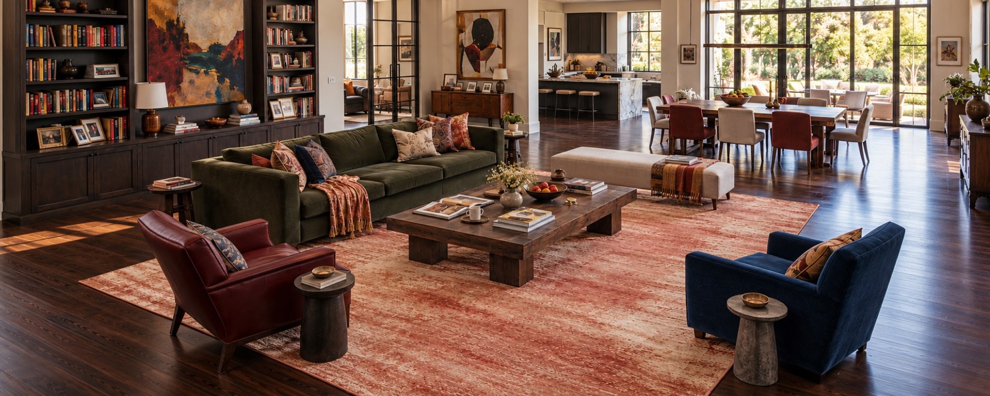
Forest Green: A Rich, Collected Living Room
Forest green works particularly well in spacious living rooms with substantial furniture and architectural detail. Combine green walls with a deep green sofa, olive-toned upholstery and darker accents.
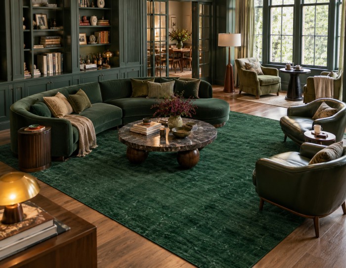
A green rug can reinforce the palette, while wooden furniture and tactile fabrics add warmth. Books, comfortable seating and thoughtfully chosen everyday objects keep the room from feeling like a staged showroom. Explore more green rugs to find shades that complement the rest of the room.
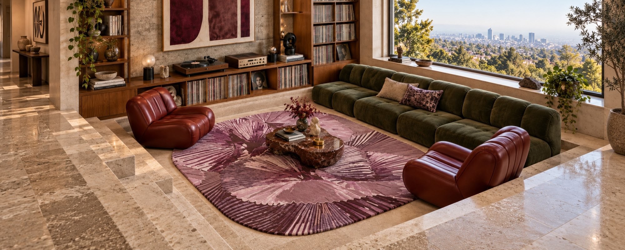
Burgundy: A Bold, Sophisticated Interior
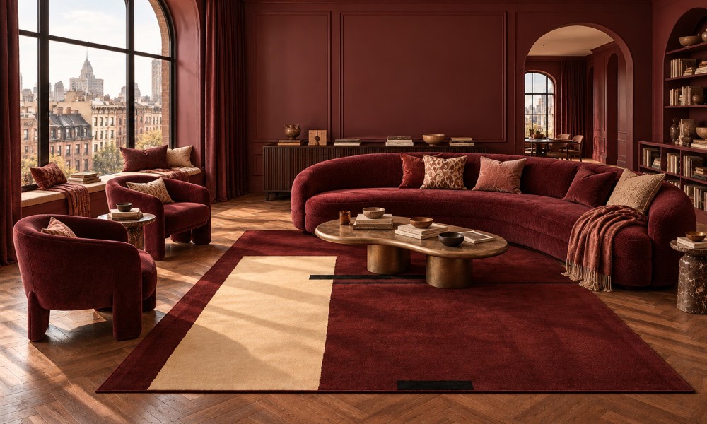
Burgundy creates a dramatic setting without requiring multiple colours. Pair wine-coloured walls with an oxblood sofa, muted rose cushions, and plum-toned details.
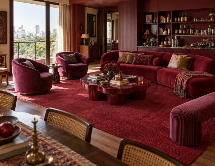
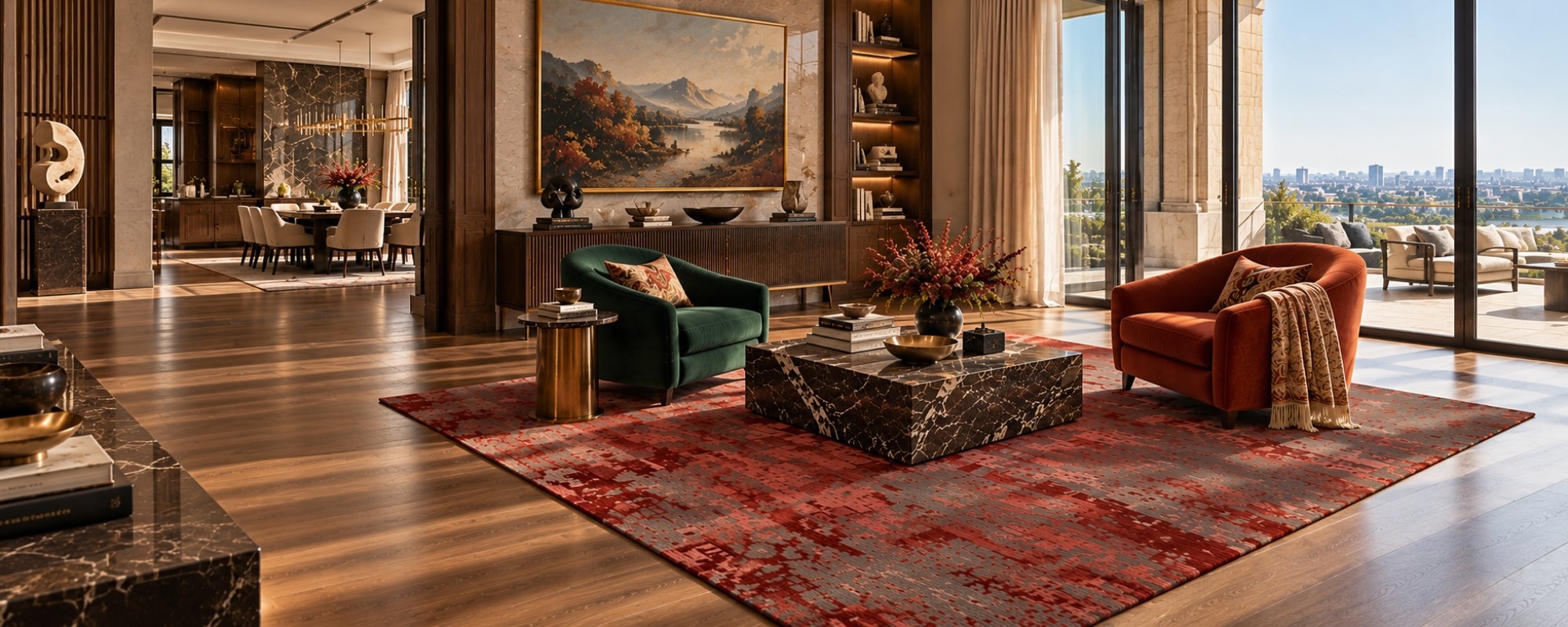
A burgundy rug can anchor the seating area and connect the different shades. This palette works especially well in larger living rooms where the deeper tones have room to breathe. Varying the finishes across velvet upholstery, painted walls, and textured textiles prevents the space from feeling too uniform.
Cobalt Blue: A Confident, Contemporary Space
Cobalt blue brings energy and personality to a monochromatic interior. Use it across selected walls, upholstered furniture, and smaller accessories, varying the intensity to avoid a uniform block of colour.
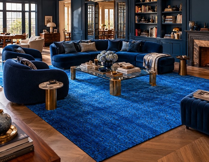
A deeper blue rug can ground the room, while sculptural furniture and contrasting material finishes add definition. This approach suits contemporary spaces with generous daylight. Explore blue rugs to find complementary shades for a layered blue interior.
Terracotta: Warmth without Visual Clutter
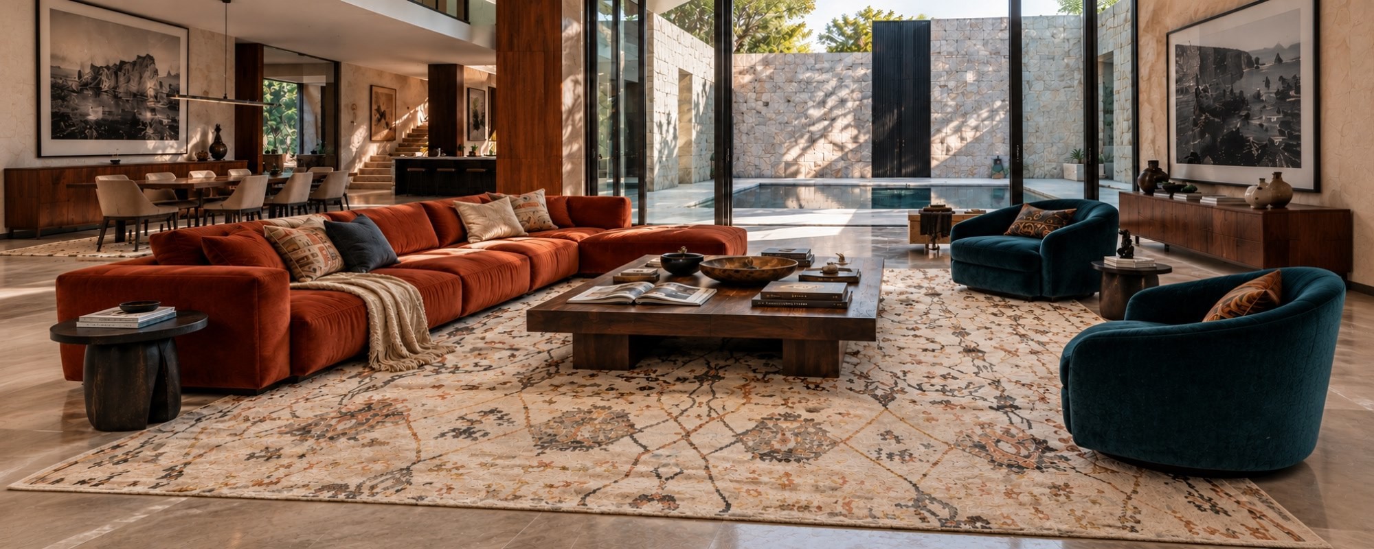
Terracotta offers a warmer alternative to cooler monochromatic palettes. Combine clay-coloured walls with rust upholstery, burnt orange accents, and deeper reddish-brown details.
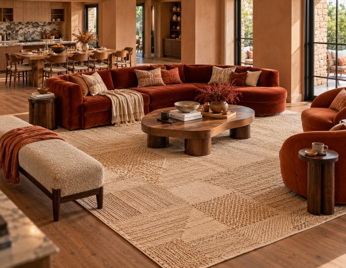
Introduce natural wood and textured fabrics to create variation within the same colour family. A terracotta-toned rug can help define an open-plan living area while maintaining a cohesive look.
Lavender: A soft Monochromatic Bedroom
A monochromatic bedroom does not have to rely on neutrals. Lavender can create a calm, expressive space when used across the walls, bedding, upholstered headboard, and soft furnishings.
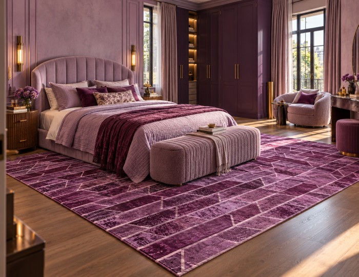
Combine pale lilac with muted violet and deeper plum details for contrast. A bedroom rug in a complementary purple tone can add comfort beside the bed and help the room feel visually complete without introducing a contrasting colour.
Mustard and Ochre: An Energetic Living Space
Mustard and ochre bring warmth and character to a room. Use softer golden tones on larger surfaces and deeper mustard shades across upholstery or accent furniture.
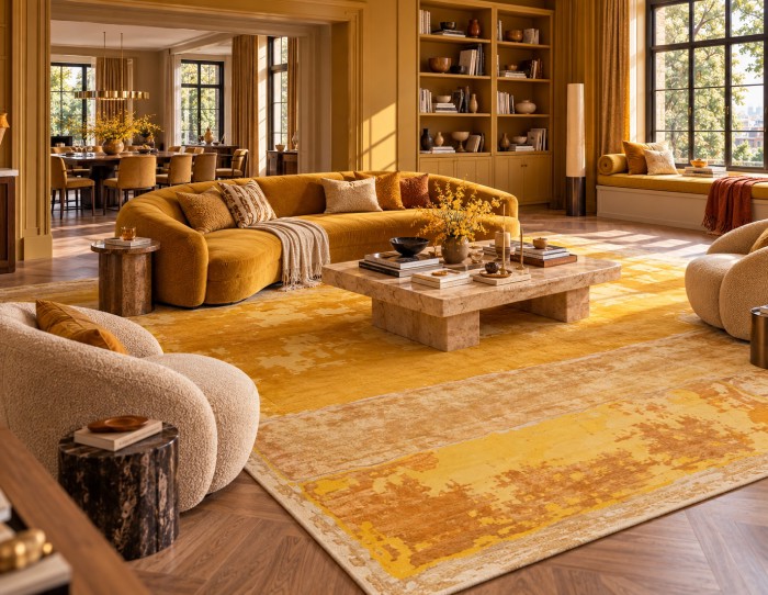
A coordinating rug can connect the seating area, while timber finishes and tactile textiles prevent the palette from becoming visually heavy. Keep the shades varied rather than matching every item exactly.
Charcoal Grey: A Modern, Architectural Interior
Charcoal grey is ideal for interiors that rely on shape, proportion and material contrast. Pair lighter grey walls with charcoal seating, darker cabinetry and textured soft furnishings.
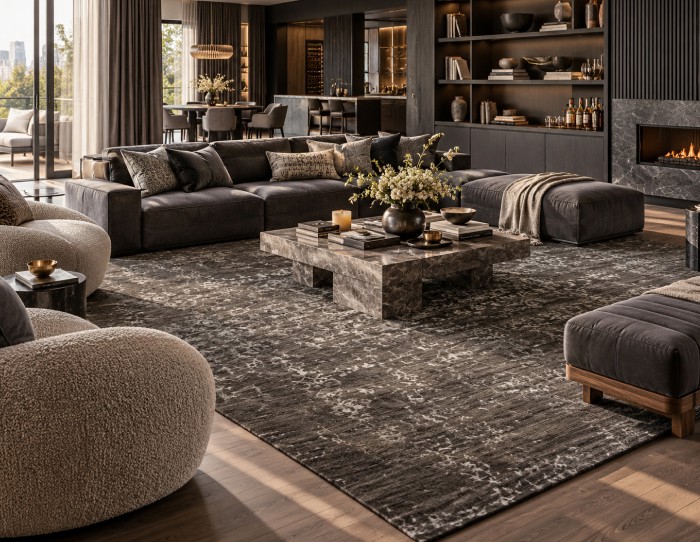
A grey rug can soften the overall composition and distinguish the seating zone from the surrounding floor. Vary matte, woven and smooth finishes so the room feels layered rather than severe. Browse grey rugs for additional tonal options.
Chocolate Brown: A Comfortable, Layered Room
Chocolate brown creates an enveloping atmosphere that suits reading lounges, living rooms and intimate sitting areas. Combine cocoa-coloured walls or cabinetry with deep brown upholstery, caramel-brown accents and darker timber.
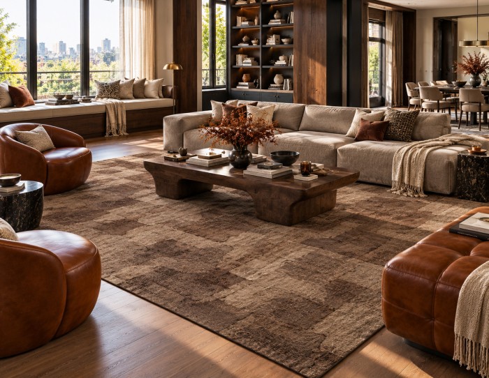
A brown rug can reinforce the palette and bring visual weight to the seating arrangement. Books, layered cushions and comfortable furniture add a sense of everyday use. Explore brown rugs for more options within this colour family.
Sage green and navy are also worth considering. Sage creates a softer, more relaxed interior, while navy offers a deeper alternative to cobalt blue with a more restrained mood.
Monochromatic Color Scheme Examples for Different Rooms
The same colour can feel different depending on how it is used. Furniture placement, natural light, and surface finishes all influence the final result. These monochromatic color scheme examples show how to adapt the approach to individual rooms.
Monochromatic Living Room
A monochromatic living room works best when the seating, walls and flooring have enough tonal variation to remain distinct. Start with the sofa as the main anchor, then coordinate the walls, curtains and rug around different shades of the same colour.
For example, a green sofa can sit against softer green walls, with a darker green rug defining the seating area. Living room area rugs also help connect a sofa, accent chairs and coffee table, making an open-plan layout feel more cohesive.
Monochromatic Bedroom
In a monochromatic bedroom, layer the colour across the walls, bedding, headboard and rug. Lavender, sage and chocolate brown are useful options, depending on whether you prefer a lighter or more enveloping atmosphere.
Keep the darkest tones in selected elements rather than using them everywhere. A bedroom rug in a related shade can add warmth and create a softer transition between the bed and floor.
Monochromatic Kitchen
A monochromatic kitchen can look cohesive without feeling repetitive. Consider sage cabinetry with deeper green details, or a terracotta palette with clay-toned walls and warm reddish-brown accents.
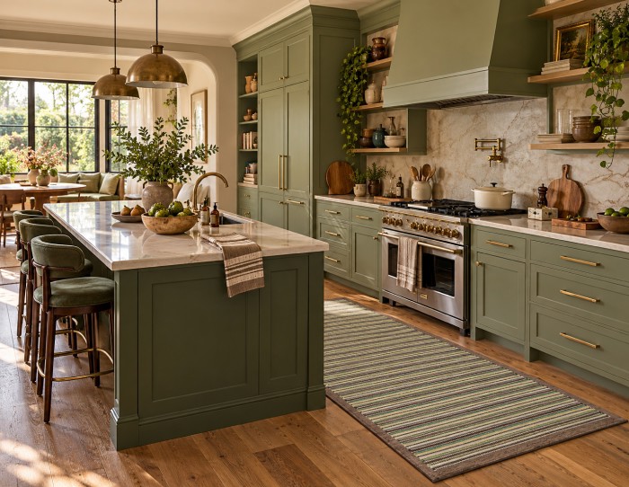
Vary the finishes between cabinetry, countertops, hardware, and seating. If you introduce a kitchen rug, choose a colour that belongs to the same family and a practical size that suits the available floor space.
Monochromatic Color Scheme vs Colour Drenching
Monochromatic interior design and colour drenching are closely related, but they are not the same.
A monochromatic color scheme uses different shades, tints and tones of one hue throughout a room. Other elements, including the flooring, furniture and architectural details, may remain distinct.
Colour drenching takes the idea further by extending one colour across walls, ceilings, doors, skirting boards and sometimes furniture.
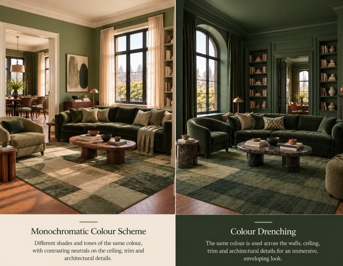
For example, a monochromatic burgundy living room might combine burgundy walls with a wine-coloured sofa and a darker rug. A colour-drenched version could extend burgundy across the ceiling, doors, and woodwork as well.
Choose the approach that suits your room. Colour drenching makes a stronger statement, while a broader monochromatic scheme offers more flexibility.
Common Mistakes to Avoid
-
Using only one shade: Introduce lighter and darker variations to create depth.
-
Ignoring texture: Mix upholstery, wood, woven materials, and tactile rugs.
-
Overmatching furniture: Coordinated does not mean identical. Vary shapes, finishes and proportions.
-
Forgetting natural light: Test colours before applying them across large surfaces.
-
Choosing the rug as an afterthought: Consider how the rug connects the seating, walls, and floor from the beginning.
-
Overloading the room with accessories: A few meaningful objects and well-chosen furnishings often work better than excessive decoration.
Design a Room Around One Colour
A well-designed monochromatic room is not about limiting creativity. It is about using colour with intention and allowing texture, furniture, light and proportion to create interest. From a dramatic burgundy living room to a soft lavender bedroom or a richly layered chocolate brown lounge, the possibilities extend well beyond simple matching.
Start with a colour you enjoy living with, build a palette of lighter and darker variations, and choose furnishings that offer contrast through their materials and shapes. Finish with a rug that connects the room’s elements and gives the overall scheme a clear visual foundation.
With the right balance, one colour can create a room that feels distinctive, comfortable and full of character.
Frequently Asked Questions
What are monochromatic colors?
Monochromatic colors are variations of a single hue, created by changing its lightness, darkness, or intensity. In interiors, this might mean using pale sage, medium green, and deep forest green in the same room.
What is monochromatic color?
Monochromatic color refers to one hue used in different variations rather than a combination of unrelated hues. In interior design, the approach creates visual consistency while allowing contrast through texture, materials, and tonal differences.
Is black and white monochromatic?
Black and white is often described as a monochromatic scheme in interior design because it uses variations in lightness and darkness without introducing another hue. Technically, black and white are achromatic rather than hues, but the combination follows the same principle of creating contrast within a restricted palette.
Monochromatic vs Analogous: What is the difference?
A monochromatic scheme uses one hue in different variations. An analogous scheme combines neighbouring hues on the colour wheel, such as blue, blue-green and green. Monochromatic interiors usually feel more unified, while analogous palettes introduce greater colour variation.
Can a monochromatic room still feel colourful?
Absolutely. A room in cobalt blue, burgundy, forest green or terracotta can feel vibrant even when it follows a monochromatic scheme. The key is to use different intensities, materials and finishes rather than relying on several unrelated colours.


Pic Credits
Jaipur rugs / Abil Dase
Share
-
 Facebook
-
 Twitter
-
 Email
Related Posts
-
30 October 2026
- ∙
-
8 Min Read
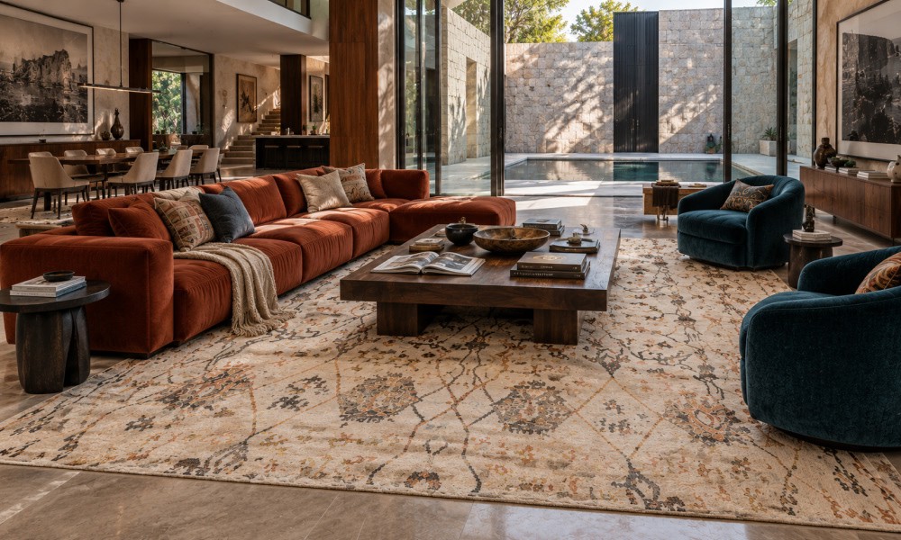
Formal Living Room Ideas That Start With the Rug
Learn how to choose the right rug for a formal living room, from selecting the correct size and placement to finding colours, patterns, and materials that suit your space. Explore traditional, transitional, and modern rug styles, along with tips on wool, silk, and hand-knotted rugs to create a living room that feels elegant, comfortable, and welcoming.
Read Article →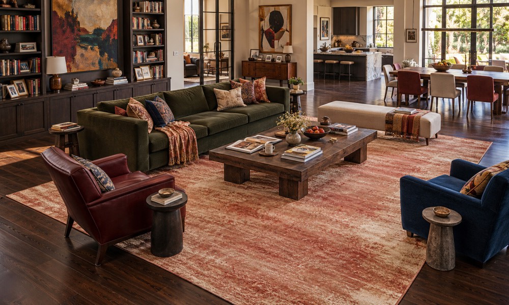
-
29 October 2026
- ∙
-
9 Min Read
Terracotta Rugs: How to Style 2026's Warmest Colour Trend
Terracotta rugs bring warmth, depth and earthy character to modern interiors. This guide explores the best colour pairings, from cream and sage green to dusty blue, along with styling ideas for living rooms and bedrooms. Learn how to choose the right rug size, compare traditional and contemporary designs, and understand why hand-knotted wool rugs offer lasting beauty and natural texture.
Read Article →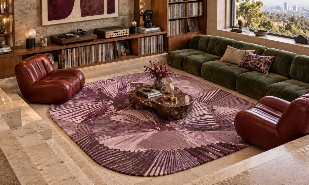
-
22 October 2026
- ∙
-
8 Min Read
Conversation Pits Are Back: How to Choose the Right Rug for a Sunken Living Room
Conversation pits are back, and the right rug makes or breaks them. This guide explains what a conversation pit is, how to get the look without a sunken floor, and which rug shapes suit pits. It covers sizing, low-pile safety near steps, hand-tufted versus hand-knotted options, custom shapes, and styling a 70s living room so it feels fresh, not dated.
Read Article →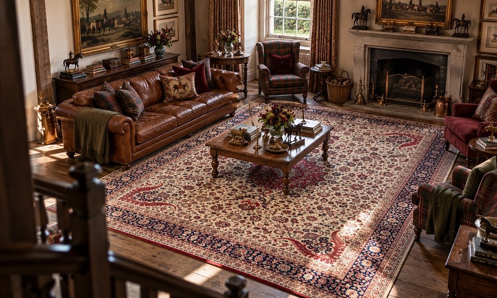
-
21 October 2026
- ∙
-
7 Min Read
Old Money Interiors: The Understated Rugs Behind the Look
Old money interiors look collected, not decorated, and the rug is often what makes them work. This guide covers the rugs that suit the style: hand-knotted wool, wool-silk, and antique-wash finishes. You’ll also find the muted colours that define it, room-by-room styling tips, how it differs from quiet luxury, and why heirloom craft matters for a home built to last.
Read Article →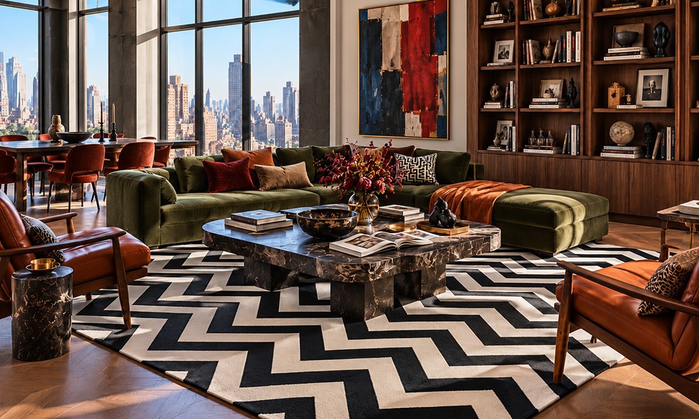
-
19 October 2026
- ∙
-
7 Min Read
Herringbone Rugs: A Designer Pattern for Timeless Rooms
Herringbone is one of the few rug patterns that never dates. This guide explains how herringbone differs from chevron, when to choose flatweave or hand-tufted, which pattern scale suits small and large rooms, and which direction the zigzag should run. It also covers room-by-room placement, pet-friendly choices, and simple weave-specific care, so your herringbone rug always looks designed.
Read Article →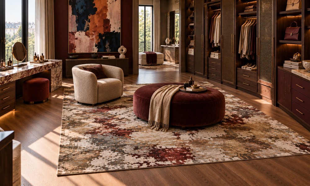
-
16 October 2026
- ∙
-
8 Min Read
Walk-In Wardrobes and Dressing Rooms: Rugs for the Most Personal Room
A dressing room is the most personal room in the house, yet its floor is often forgotten. This dressing room design guide explains how to choose a soft rug for a walk-in wardrobe: wool or wool-silk materials, hand-tufted versus hand-knotted construction, the right size around fitted storage, colours that suit your joinery, and simple care tips that keep it looking luxurious.
Read Article →