You are on our International website. Please select your region to see content specific for your location





 Profile
 Orders
 Wishlist
 Change Password
 Logout


Latest Blogs
ideas and inspiration
Unveiling Pantone Color of the Year 2026: Cloud Dancer, A Canvas of Calm
- 06 December 2025
- |
- 9 Min Read
- |
- By Jaipur Rugs
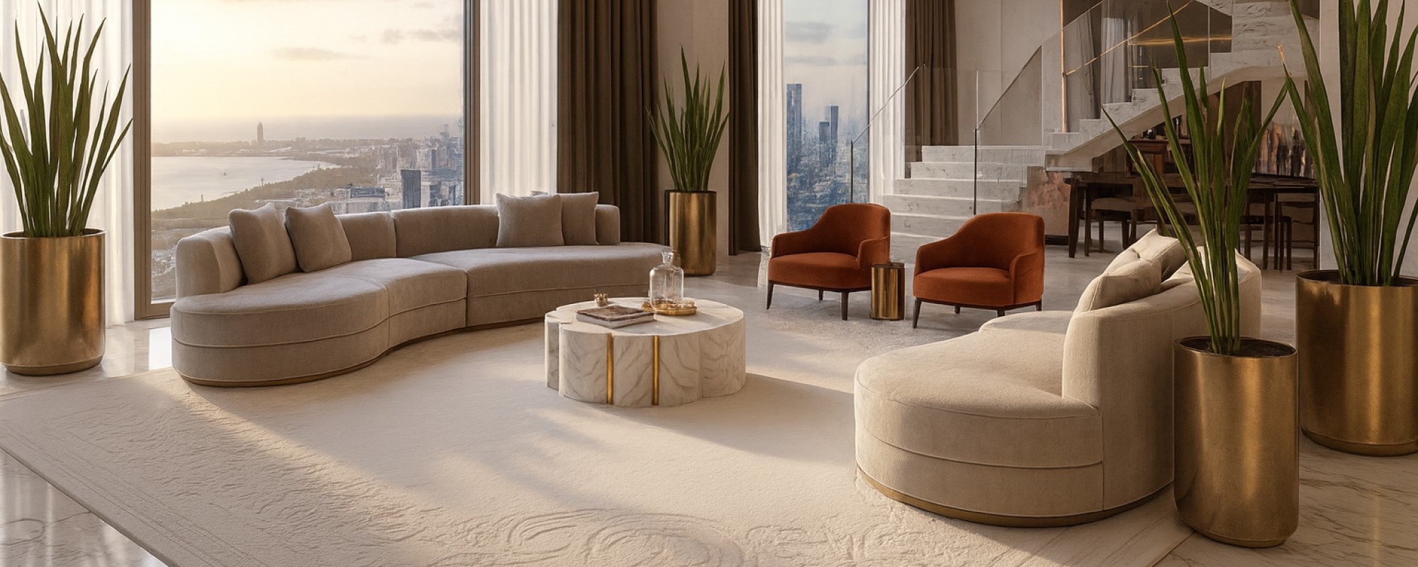
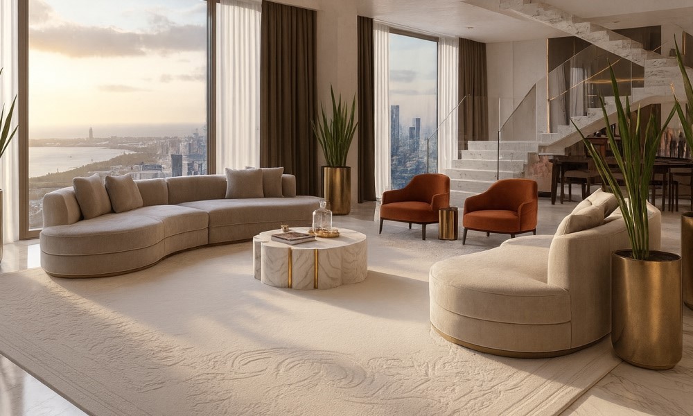
Cloud Dancer is the official Pantone Color of the Year 2026. This luxurious, serene white signals a major shift toward quiet reflection in all design, acting as the ultimate blank canvas. It's ideal for creating elegant spaces, influencing everything from white and ivory rugs to high fashion. The 2026 color of the year is the ultimate sophisticated clean slate.
The world of design holds its breath each December, awaiting the annual proclamation from the Pantone Color Institute. This choice encapsulates the collective mood and aspirations of the global culture. This year, they didn't pick a bold, screaming statement. Instead, they chose a luxurious whisper: PANTONE 11-4201 Cloud Dancer.
This near-white is the essence of soft, warm sophistication, a color that feels like a cashmere blanket on a cool morning. Get this: it's a historical choice, as it's the first true white ever selected for the title. The official color of the year 2026 isn't just a hue; it's a detox. It's a deliberate, decadent step back from sensory overload, embracing what we're calling "Extravagant Stillness."
In a world desperate for a moment to breathe, the choice of cloud dancer for the pantone color of the year couldn't be more on point. It evokes gentle pleasure without overstimulation, offering us a chic, serene space to be. Ready to dive into the most luxurious neutral of the decade?
The New Meaning of Luxury: Less is Not a Bore
When you hear "white," you might think basic. But true luxury is often found in the subtle, the nuanced, and the impeccably sourced. Cloud Dancer is the ultimate expression of this principle. It's complex because it forces us to focus on texture, material, and light, the real pillars of high-end design.
The philosophy behind the 2026 color of the year is profound: we're seeking quality over quantity, silence over sound, and enduring elegance over fleeting trends. Leatrice Eiseman, Executive Director of the Pantone Color Institute, emphasizes that this choice is a conscious statement of simplification, designed to enhance focus and provide release from external distractions.
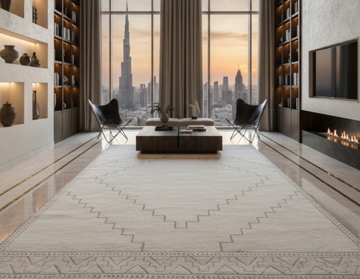
This specific pantone color of the year is the perfect base for building a life and a home that feels curated, intentional, and deeply personal. It's the color of a blank slate, but one pre-loaded with potential.
Interiors: Where Cloud Dancer Becomes a Vibe
If you're looking to inject that fresh, aspirational energy into your home, PANTONE 11-4201 Cloud Dancer is your new best friend. It transforms a room, making it feel instantly larger, more light-filled, and infinitely more expensive. This shade offers "clarity without coldness," making it the perfect partner for organic materials like raw oak, clay plaster, and unpolished stone.
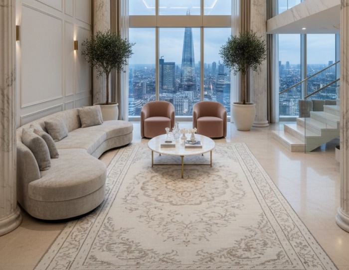
But here's the secret to making this color truly pop: texture, texture, texture.
The Extravagant Cloudscape Underfoot
The floor is the foundation of your design narrative, and it's here that cloud dancer truly shines. The era of plain flooring is over; we are craving touchable, tailored surfaces that speak of meticulous craftsmanship.
The Artisanal Touch
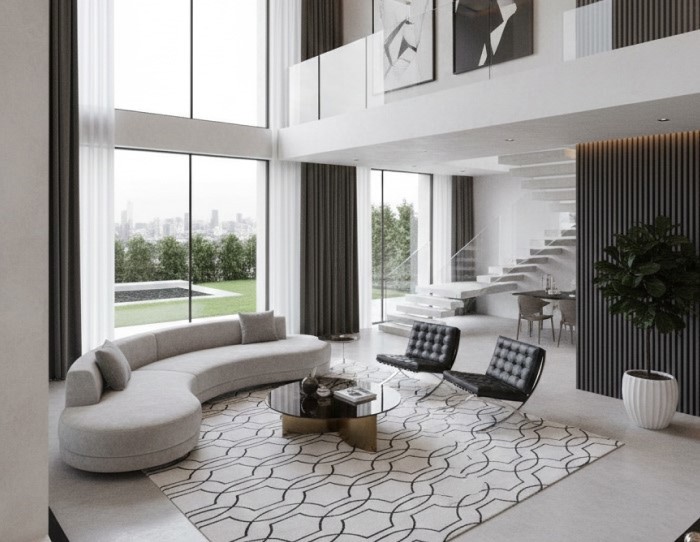
Nothing screams quiet luxury like an incredible floor covering. Imagine hand-knotted rugs where every knot is a testament to skill and time, featuring the soft nuances of this white. The slight color variation in the natural fibers of pure wool rugs or white and ivory rugs adds depth that a single color wash could never achieve.
Shimmering Sophistication
For the ultimate glamorous upgrade, look to the intersection of materials. Wool and bamboo silk rugs in the Cloud Dancer palette provide a stunning contrast. The matte wool offers that grounding, serene feeling. At the same time, the bamboo silk fibers catch and reflect light with a shimmering, almost ethereal quality, making the floor feel alive and truly extravagant.
Tailored to Perfection
High-end design is all about customization. The rise of custom rugs directly aligns with the philosophy of the pantone color: creating a unique, personalized haven. Whether you opt for the dense, defined loops of premium hand-tufted rugs or a flatweave, tailoring the shape and scale ensures your Cloud Dancer space is flawlessly executed.
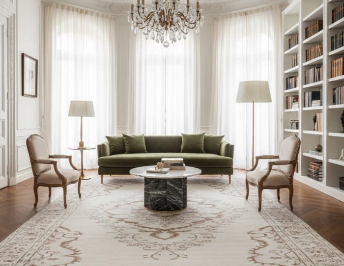
Grounding Art
This color for this year is the perfect partner to more complex, patterned collections. It grounds vibrant accessories and makes complex pieces, like intricate zuri rugs, feel less overwhelming and more harmonized, so their patterns can be appreciated in a space that feels inherently calm.
Architectural Impact: Cloud Dancer as the Foundation of Lavish Interiors
The influence of the 2026 color of the year is most profoundly felt within the four walls of high-end homes, where it acts as a silent but powerful architectural statement. This is where the true value of a bespoke product, like your rug, is dramatically amplified.
Styling the Cloudscape: Grounding Ultra-Luxury
Cloud Dancer in a large-scale application, think walls, ceilings, and marble flooring, achieves an immediate sense of expensive serenity. This shade provides the expansive visual silence necessary for other elements to become tactile focal points. It is the sophisticated backdrop against which rich materials, unique textures, and architectural details truly pop.
This is about making space feel grander and more intentional.
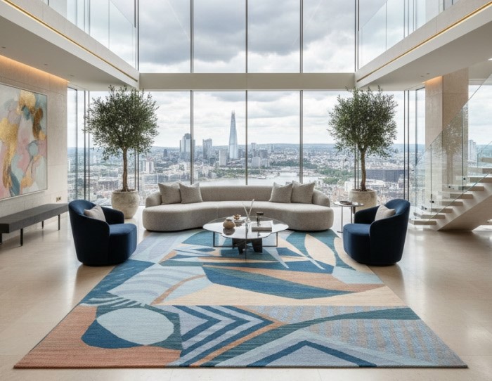
The Rug as the Centerpiece: Defining the Vibe
In the luxury interior, the rug isn't an afterthought; it's the primary piece of textile art that defines the room's mood.
-
Elevating Materials: With a foundation of cloud dancer, your wool and bamboo silk rugs transition from floor coverings to sculptural installations. The soft, near-white walls allow the rug's contrasting sheen and matte fibers to catch the light and emphasize their intricate quality.
-
The Power of Scale: In grand rooms with double-height ceilings (common in ultra-luxury homes), a generously sized hand-knotted rugs in this pale palette ensures the entire space remains grounded and welcoming, preventing it from feeling cold or cavernous.
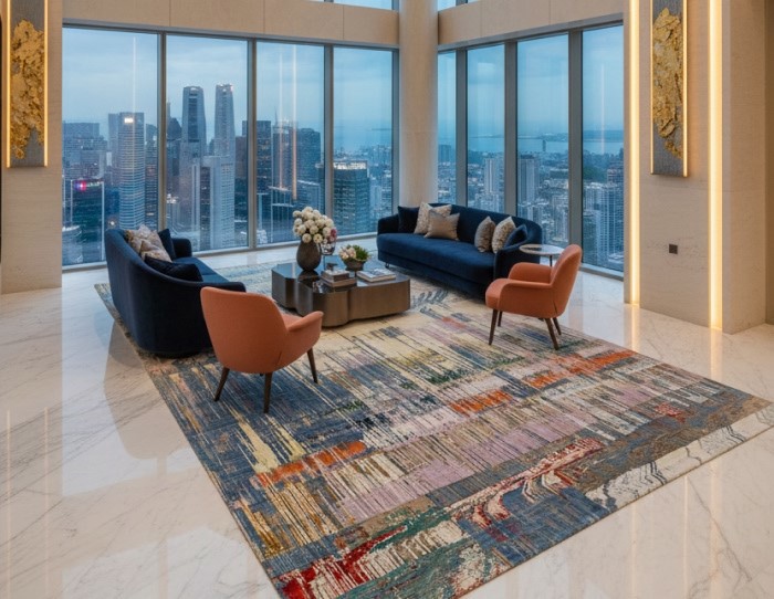
-
Tonal Mastery: For a sophisticated, layered look, designers use cloud dancer walls and soft-white upholstery, allowing rugs like the patchwork white and ivory rugs to showcase their tonal variations. The slight shift from pure white to pale cream or misted grey becomes the design statement itself.
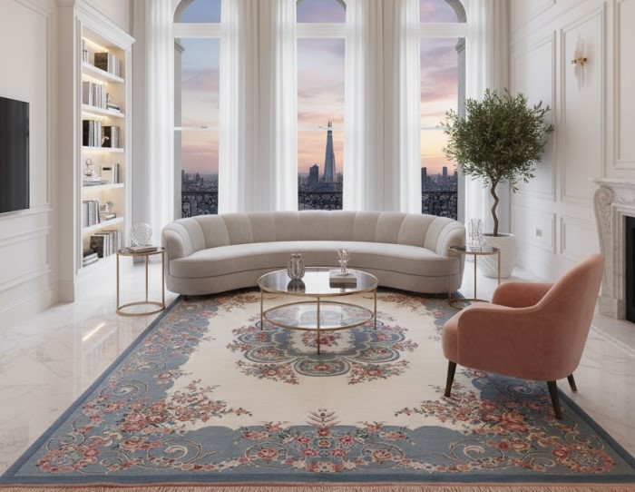
Designing a Dialogue: Cloud Dancer and Its Partners
What makes cloud dancer so genuinely extravagant is their supreme versatility. It's the ultimate team player, but it demands quality from its partners. The Pantone Color Institute has curated three specific, inspiring palettes that showcase the range of this extraordinary neutral.
Powdered Pastels: Subtle, Nuanced Shifts
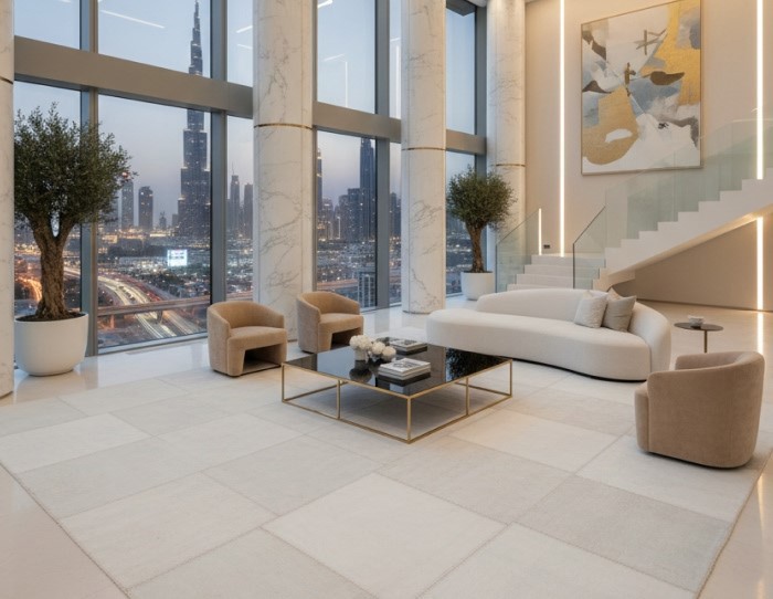
For a look of understated refinement and gentle pleasure, Pantone suggests pairing PANTONE Cloud Dancer with the Powdered Pastels palette. Pastel and neutral tones make compatible combinations to Cloud Dancer, offering subtle shifts in hue that are nuanced, pleasing, and understated. This combination of dusty lavender, pale peach, or creamy apricot elevates the concept of sophisticated layering, proving that quiet colors can still create a powerful emotional space.
Light & Shadow: Effortless Contrast
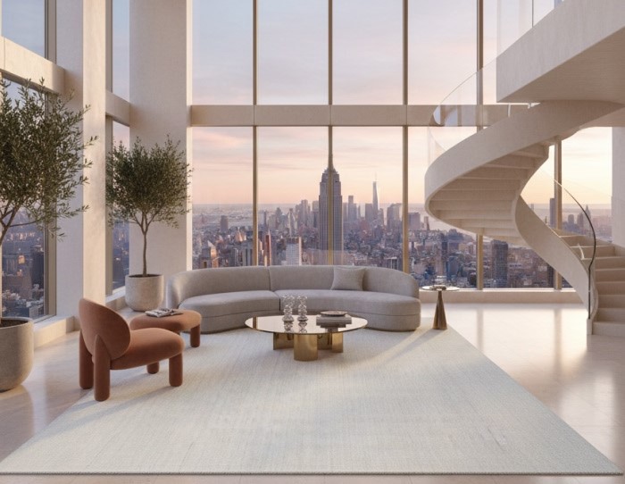
For designers seeking grounding and drama without losing serenity, the Light & Shadow palette is key. Cloud Dancer gracefully blends into a veiled palette of softened hues that ultimately dissolve into shadowy shades, creating an easy, effortless contrast in colour. Imagine pairing this ethereal white with deep charcoal, inky black, or rich espresso brown. This strong contrast feels architectural, deliberate, and undeniably expensive, perfect for anchoring a modern living room.
Atmospheric: Breezy and Ethereal
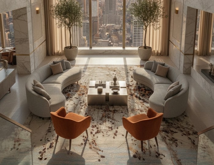
This palette truly captures the feeling suggested by the name cloud dancer. It is expansive, breezy, and utterly refreshing. Cloud Dancer lifts us to lofty heights where this diaphanous white breaks through grey skies, revealing clear, breezy blues under a misted sunlight. Aqueous blue-greens emanate from the watery depths.
These pairings, like serene aqua, soft sky blue, and misted gray, are ideal for creating spaces that feel breathable, open, and meditative, perfectly capturing the tranquility of the pantone color.
The Enduring Legacy of the 2026 Color of the Year
The designation of cloud dancer is a milestone, representing a collective step back from the constant clamor of contemporary life. It's not a safe choice; it's a profound, structural one. It signifies our collective desire for a "blank canvas," a chance to let go of outdated approaches and allow for new, creative ideas to emerge.
This specific shade of white encourages mindfulness, personal expression, and a deeply human connection to our surroundings.
As this influential pantone color permeates design and culture throughout the upcoming year, its message will be clear: seek clarity in the cacophony, value quiet moments, and embrace the simple sophistication of a fresh start. This particular color for this year offers a vision of serenity and renewal, marking 2026 color of the year, a period defined by thoughtful indulgence and enduring elegance. It's an extravagant, yet beautifully restrained, foundation for the future of design.
FAQs
What is the pantone color of the year for 2026?
The official Pantone Color of the Year 2026 is Cloud Dancer. It is a soft, airy, and balanced shade of white.
Has Pantone ever chosen white as the Color of the Year before?
No, PANTONE Cloud Dancer is the first true white ever selected as the official Color of the Year since the program's inception in 1999. It breaks tradition, moving away from previous near-neutrals and expressive colors.
What are the specific technical color codes for Cloud Dancer?
While Pantone's official system is proprietary, the code PANTONE 11-4201 TCX (for the Cotton Textile system) is the main reference. Designers often use its digital approximations for web and screen:
-
RGB: (approx. 240, 238, 233)
-
Hex: (approx. #F0EEE9)
What is the public and critical reaction to Cloud Dancer?
The public reaction has been highly mixed and divisive. While many designers and minimalists praise its focus on calm, intentionality, and quiet luxury, others find the choice "bland," "uninspired," or even "tone-deaf," suggesting that choosing white fails to address the complex socio-political issues of the modern era.
What are the best complementary color palettes for Cloud Dancer?
Pantone suggests several palettes, which tend to fall into two main categories:
-
Serene Tonal Palettes: Pairing it with powdered pastels and soft neutrals like dusty lavenders, pale blues, and warm greiges to maintain a tranquil, cohesive feel.
-
Earthy/Playful Accents: Pairing it with richer, appetizing hues like warm caramel, papaya, or moss green to give the neutral foundation a grounded, lively anchor.
Why is Cloud Dancer considered a "liminal" or "transitional" color?
It is called "liminal" because it symbolizes a "between-space," the space between the intense digital world and our primal need for human connection. It represents a state of transformation, serving as a blank canvas where old structures can dissolve, and new, clearer ideas can emerge.


Pic Credits
Jaipur rugs / Abil Dase
Share
-
 Facebook
-
 Twitter
-
 Email
Email
Related Posts
-
15 July 2026
- ∙
-
8 Min Read
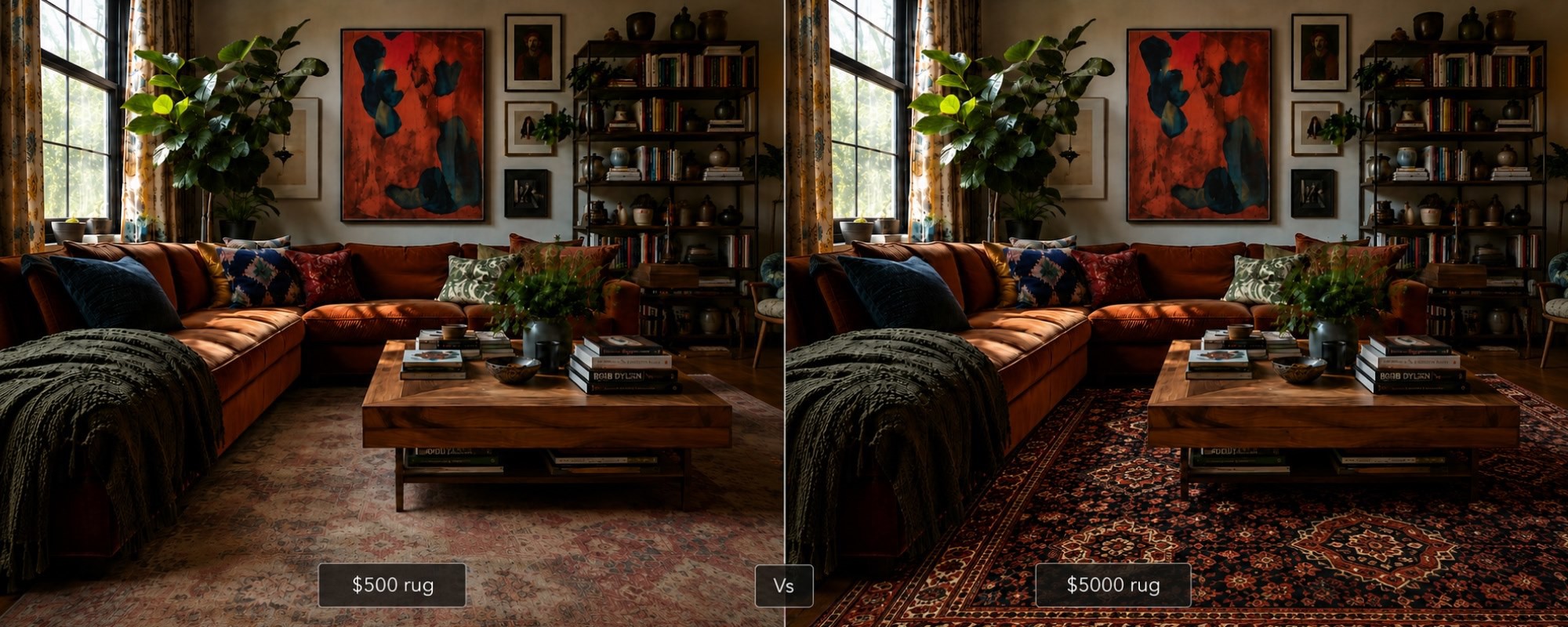
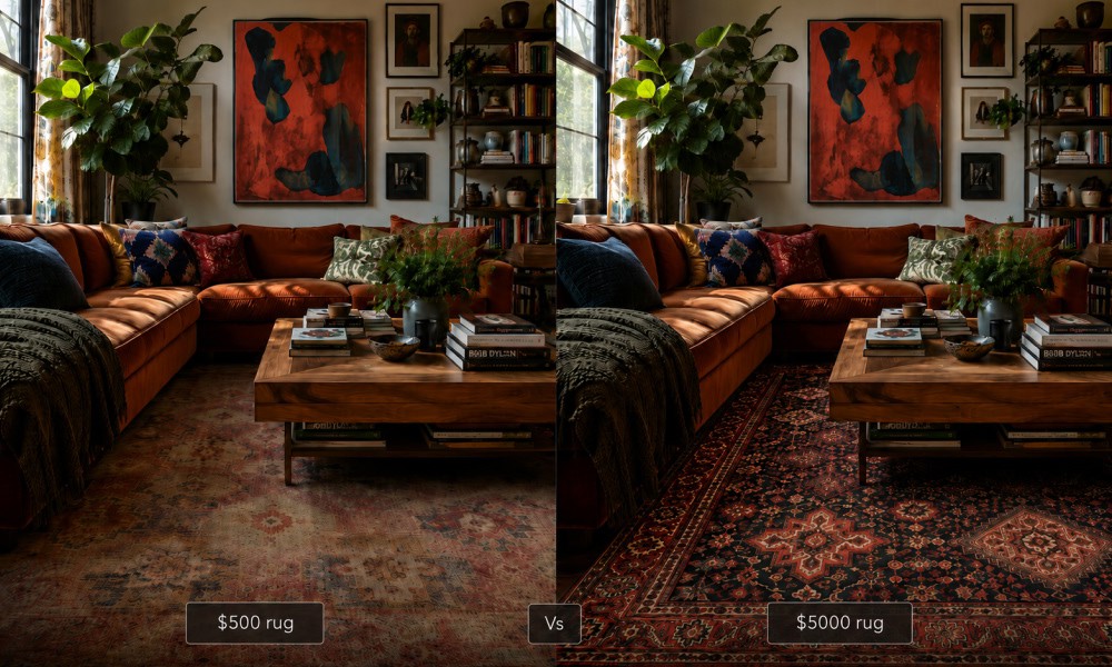
The $500 vs $5,000 Rug: An Honest Side-by-Side That No Brand Will Show You
Why do some rugs cost ten times more than others? This honest side-by-side looks at what actually separates a $500 rug from a $5,000 one: knot density, fiber quality, pile depth, and finishing. No brand bias, no marketing language. Just a clear breakdown to help you decide which one is worth it for your space and budget.
Read Article →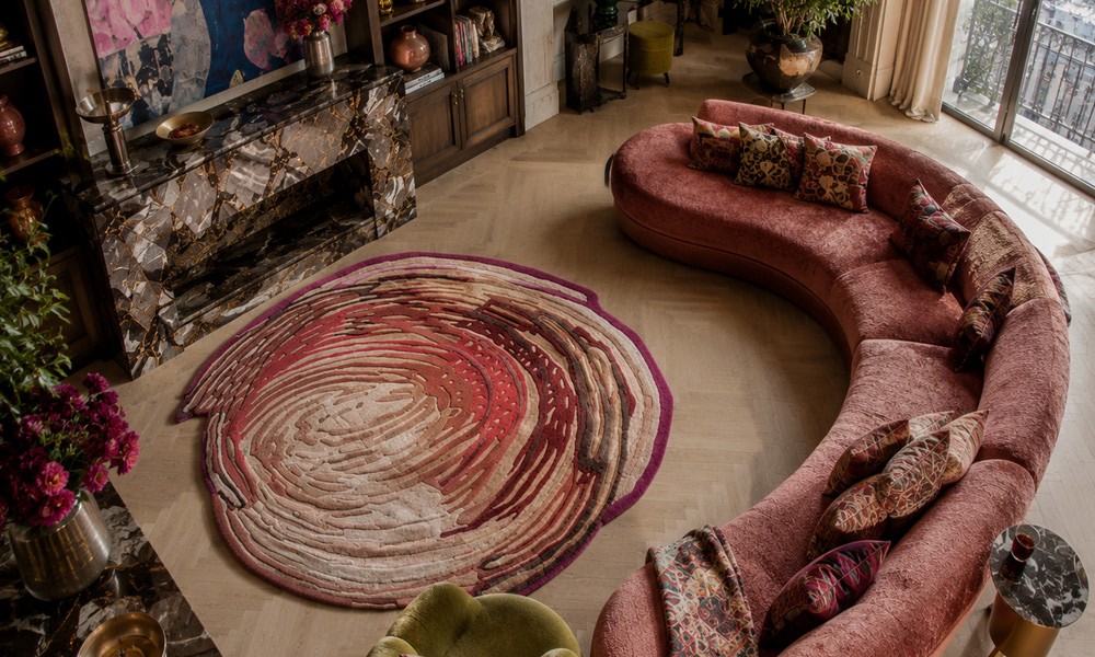
-
14 July 2026
- ∙
-
13 Min Read
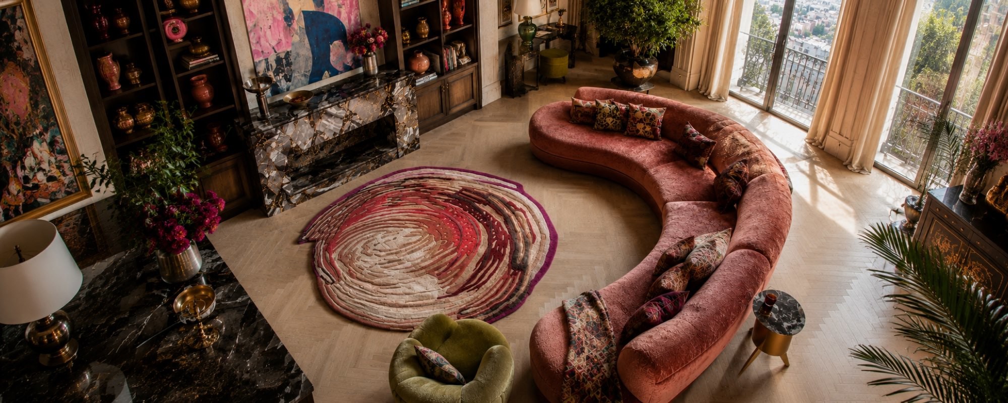
3D Rugs and Sculpted Pile: The Tactile Design Trend Redefining Floors in 2026
The rug used to finish a room. Now it starts one. 3D rugs and sculpted piles are bringing real depth and tactile texture to interiors, from hand knotted relief patterns to optical illusion designs that stop you mid-step. This is what the trend is, why it matters, and how to buy it well.
Read Article →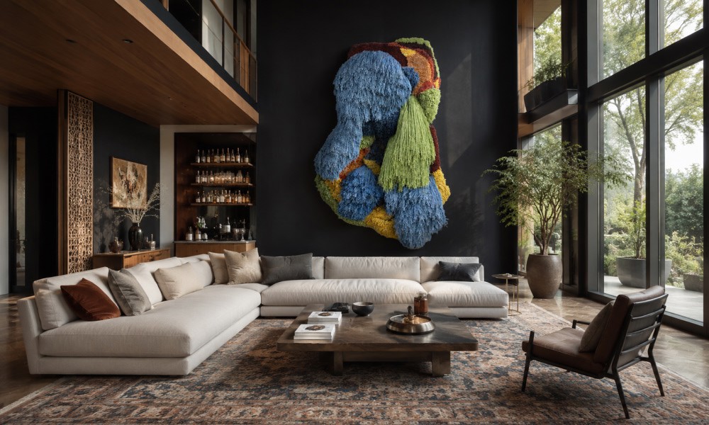
-
10 July 2026
- ∙
-
10 Min Read
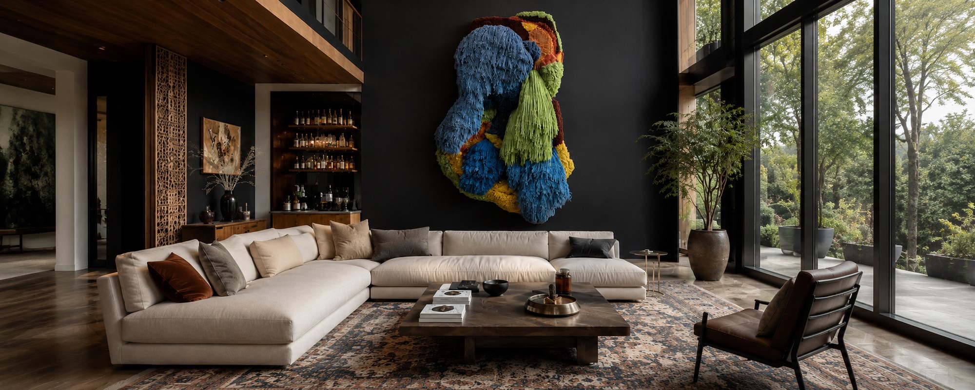
How to Pair Indian Wall Art with the Right Rug Pattern: A Room-by-Room Guide
Choosing the right rug to go with your Indian wall art does not have to be guesswork. This guide breaks it down room by room, from the living room to the bathroom and outdoor spaces. Learn how to match colors, patterns, and scale so your wall art and rug always feel like they belong together.
Read Article →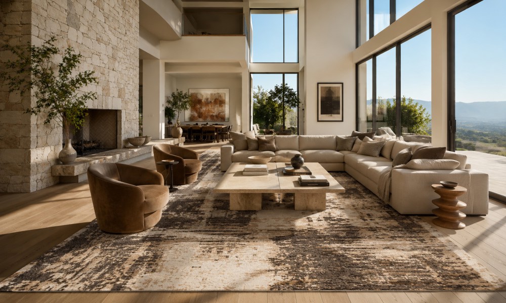
-
07 July 2026
- ∙
-
9 Min Read
How to Tell If a Rug Is Handmade: 7 Signs Experts Look For (Abrash Is One of Them)
Wondering how to know if a rug is handmade? Get an overview of 7 key characteristics that will help you identify if a rug is truly handmade and learn about its differences compared to machine-made rugs, and why they do not lose their value. Here is what to keep in mind when buying a handmade rug.
Read Article →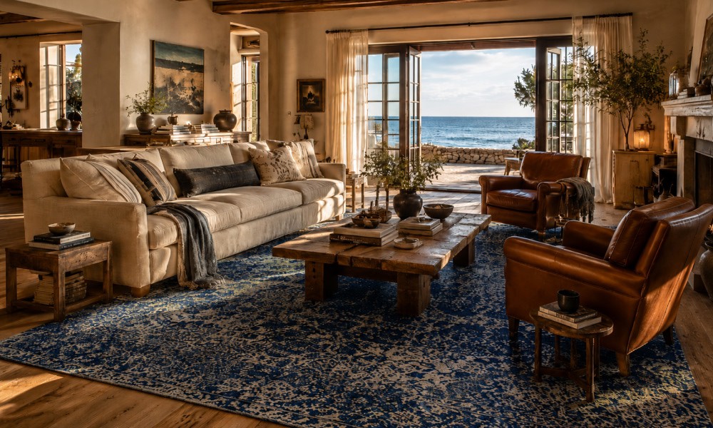
-
04 July 2026
- ∙
-
8 Min Read
Coastal Grandmother Is Evolving: The 2026 "Coastal Heritage" Aesthetic and the Rugs That Define It
The coastal grandmother design is progressing into something new and exciting by 2026. Coastal Heritage introduces texture, craftsmanship, and handmade elements to this popular design style. Here are the various rug types, colors, and decorating ideas to know about this classic coastal design trend.
Read Article →
-
22 June 2026
- ∙
-
6 Min Read
Why Top Interior Designers are Switching to Indian Handmade Rugs
High-end interior designers have begun using handmade carpets from India in place of machine-made carpets to enhance their design portfolios and ensure product longevity. The following guide will help you understand why design professionals prefer Jaipur Rugs for creating customized, ethically produced wool-and-bamboo-silk carpet designs for luxurious homes.
Read Article →