You are on our International website. Please select your region to see content specific for your location





 Profile
 Orders
 Wishlist
 Change Password
 Logout


Latest Blogs
ideas and inspiration
Summer Color Palette 2026: The Cool Blues & Sun-Faded Hues Taking Over Interiors
- 10 March 2026
- |
- 6 Min Read
- |
- By Jaipur Rugs
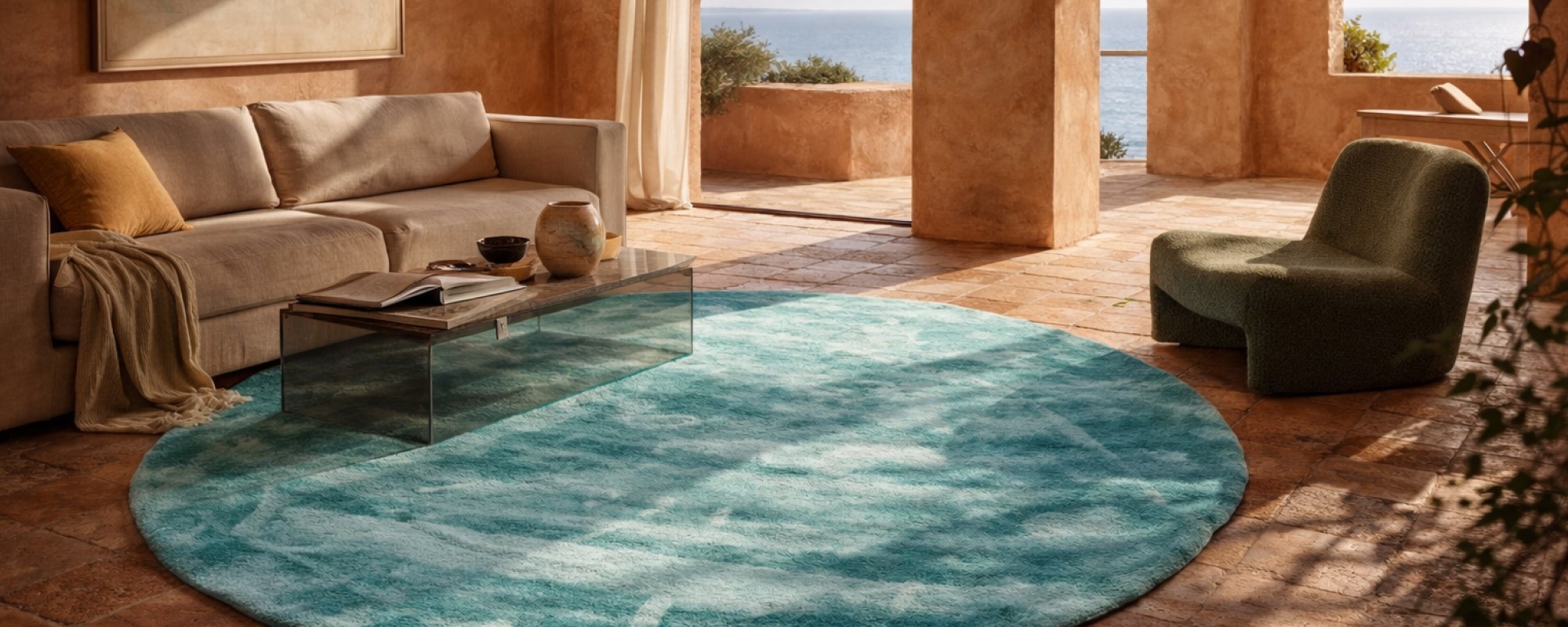
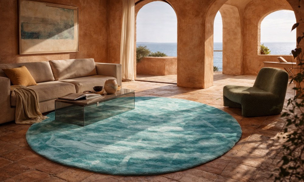
Every summer used to look the same. Tropical brights. Loud colors. Predictable palettes. But the summer color palette 2026 is breaking that pattern completely. Designers are suddenly leaning into cooler blues, sun-faded tones, and mineral hues that make interiors feel calmer, lighter, and strangely addictive. Once you notice these shades appearing on walls, textiles, and summer rugs, you start seeing them everywhere. The full story behind this shift is far more interesting than you think. Continue reading..
Every summer used to arrive in interiors like a carnival. Citrus yellows, flamingo pinks, tropical greens. Loud, cheerful, forgettable.
But the summer color palette 2026 is doing something far more interesting. It’s lowering its voice.
Across design studios from Copenhagen to California, interiors are slipping into cool mineral blues, sun-faded neutrals, softened peach pigments, and linen whites that look as though they have been gently weathered by sunlight itself. The new summer season color palette is not chasing brightness. It is chasing atmosphere.
Designers have discovered something surprisingly simple. The colors that make a home feel cooler are rarely the brightest ones. They are the ones that feel aged, breathable, and slightly quiet.
Once these summer palette colors enter a room, they rarely stop at paint. They move through linen upholstery, handmade ceramics, airy cotton textiles, and increasingly, the grounding element designers now begin with first: summer rugs.
The Defining Summer Color Palette 2026
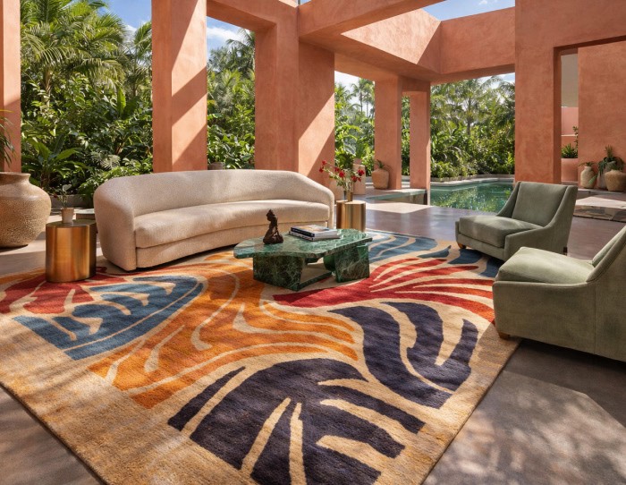
The summer color palette for 2026 is built around colors that behave like natural light, rather than being decorative. Cool blues, mineral greens, warm linen whites, and sun-faded peach tones dominate the current soft summer color palette because they diffuse brightness instead of amplifying it.
Here’s what is shaping the summer palette colors:
-
Cool atmospheric blues: Think sky at 7 a.m. rather than tropical ocean at noon. These muted blues visually lower a room’s perceived temperature and create the calm backdrop designers now prioritize.
-
Sun-washed neutrals: Sandstone, pale clay, chalk, and bleached wood tones appear everywhere because they mirror surfaces softened by sunlight over time.
-
Mineral greens: Eucalyptus, sage, and sea-glass green rugs bring organic depth while remaining soft enough to coexist with neutral interiors.
-
Soft peach pigments: Instead of bright coral, designers are leaning toward peach tones that resemble pigments gently faded on Mediterranean walls.
-
Warm linen whites: Off-whites with subtle beige undertones soften daylight and prevent interiors from feeling stark.
What makes this soft summer color palette powerful is restraint. No color competes for attention. Each shade behaves like part of the same landscape.
Why the Summer Season Color Palette Is Becoming Softer and Cooler?
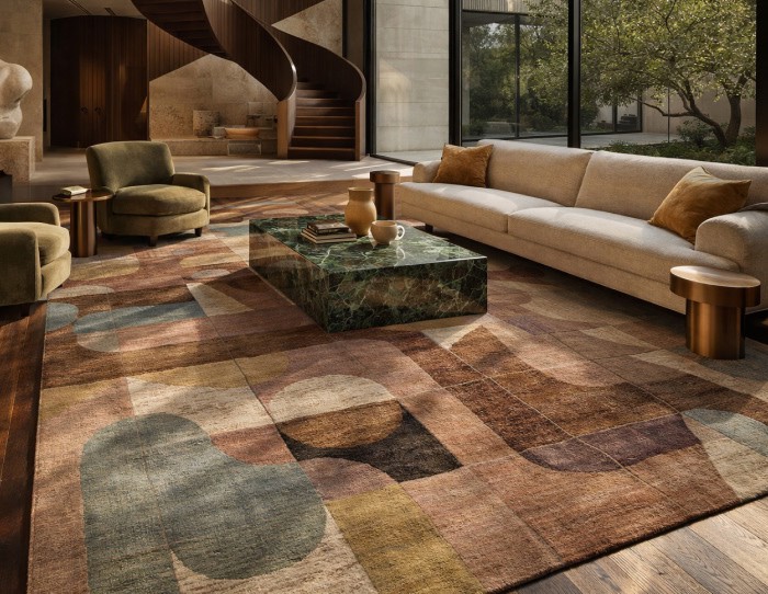
The summer season color palette is becoming softer because interior design itself is becoming calmer. Over the past few years, designers have gradually replaced high-contrast interiors with environments that reduce visual intensity.
Here’s what is shaping today’s summer color palettes and why the cool summer color palette is dominating the conversation:
-
Climate-aware interiors. Cooler tones reflect natural light and create the psychological impression of cooler spaces during hotter months.
-
Wellness-driven design. Interior environments are increasingly designed to reduce overstimulation. Muted palettes help achieve that.
-
Natural material influence. Stone, linen, wool rug, and raw wood all sit more comfortably beside softened pigments than bold saturated colors.
-
The rise of sun-washed aesthetics. Architectural styles influenced by Mediterranean and coastal environments continue to influence global interiors.
-
Layered tonal design. Instead of dramatic contrast, designers now build spaces through small variations of similar hues.
The result is a soft summer color palette 2026 that feels less decorative and more atmospheric.
How Designers Are Using the Summer Color Palette 2026 in Interiors?
Designers rarely apply the summer color palette 2026 to a single surface. Instead, the palette moves through layers of the room, creating a quiet atmosphere rather than an obvious color choice.
Here is how the summer palette colors are appearing inside contemporary homes:
-
Walls shifting toward mineral tones. Cool blues and pale greens are gradually replacing stark white walls because they soften sunlight and create visual depth.
-
Upholstery in breathable fabrics. Linen seating in sage, soft blue, or faded clay tones reinforces the relaxed rhythm of a summer interior.
-
Ceramics echoing natural landscapes. Hand-thrown pottery in chalk, sand, and sea-glass tones reflects the materials designers are currently gravitating toward.
-
Textiles layering subtle contrast. Cushions and sofa throws introduce small doses of peach or mineral blue without disrupting the calm palette.
-
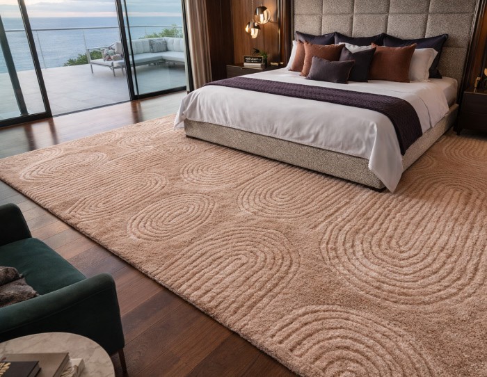
Summer rugs anchoring the room. Designers frequently begin a seasonal scheme with a summer color palette for handmade rugs. A well-chosen modern rug grounds furniture and quietly ties together every color in the palette.
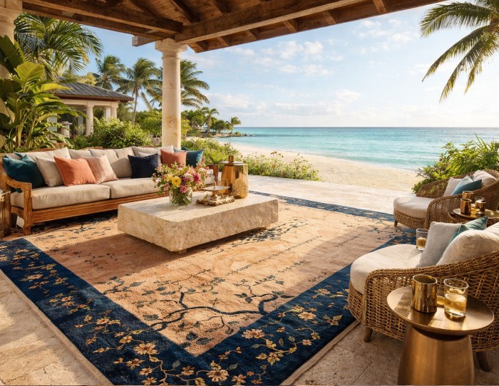
In many interiors today, designer living room rugs are no longer an afterthought. They are the piece that stabilizes the entire summer season color palette.
How to Use the Summer Color Palette 2026 Without Redesigning Your Entire Home?
Adopting a summer color palette does not require repainting your home or replacing furniture. Designers often introduce seasonal palettes through subtle adjustments that gradually shift the atmosphere.
Here are the simplest ways to bring soft summer palette colors into an existing space:
-
Swap heavier textiles for lighter fabrics. Linen curtains or cotton rugs instantly introduce cooler tones and make interiors feel breathable.
-
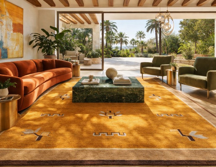
Introduce summer rugs strategically. An abstract rug in faded blues or mineral neutrals can transform the mood of a room within minutes.
-
Update smaller decorative elements. Ceramic vases, trays, and bowls in sun-washed hues quietly reinforce the seasonal palette.
-
Rotate artwork seasonally. Pieces featuring coastal landscapes or atmospheric color compositions complement summer interiors naturally.
-
Lighten window treatments. Sheer curtains or linen drapes allow more daylight while maintaining the calm softness of the palette.
These subtle adjustments allow a summer season color palette to enter a home gradually rather than dramatically.
Summing Up..
The summer color palette 2026 reflects a broader change in how interiors are being designed. Homes are slowly stepping away from energetic seasonal colors and embracing tones that feel calmer, cooler, and more breathable.
And while paint often receives the most attention, seasonal palettes frequently emerge through textiles, ceramics, and especially summer rugs or any designer rug, which anchor color and quietly hold the room together.
In the end, the most compelling interiors rarely shout their color stories. They let them settle slowly into the room, like sunlight fading gently across a wall.
We will be back with another blog soon.
Till then, stay tuned and explore Jaipur Rugs!
FAQs
What are summer colors?
Summer colors are light, cool, and soft shades inspired by seasonal elements like sky, water, and fresh foliage. Common examples include sky blue, lavender, mint green, soft pink, pale yellow, and sandy neutrals.
Why are cool tones common in summer colors?
Cool tones help create a visually refreshing effect, which suits warm weather. Colors like blue, sage green, and lavender reflect light well and make spaces or outfits feel lighter and more breathable.
What are the most popular summer colors?
Popular summer colors include sky blue, coral, lavender, mint green, pale yellow, and soft peach. These shades feel bright yet airy, making them widely used in fashion, interiors, and seasonal design palettes.
What is a soft summer color palette?
A soft summer color palette features cool-toned, muted colors with low contrast. It includes shades like dusty rose, muted lavender, soft blue-grey, sage green, and cool taupe.
What colors belong in the soft summer palette?
Soft summer colors include dusty blue, muted mauve, sage green, lavender grey, cool taupe, and charcoal. These shades are cool-toned and slightly desaturated, creating a subtle and balanced color harmony.
Which colors should soft summer avoid?
Soft summer palettes should avoid bright, warm, or highly saturated colors, such as neon shades, strong orange, and vivid red. These colors disrupt the muted, cool harmony of the palette.


Pic Credits
Jaipur rugs / Abil Dase
Share
-
 Facebook
-
 Twitter
-
 Email
Email
Related Posts
-
15 July 2026
- ∙
-
8 Min Read
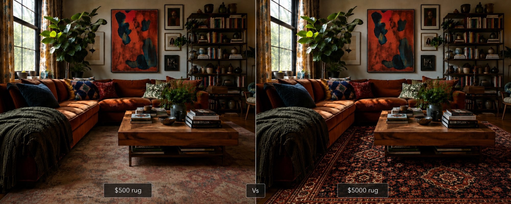
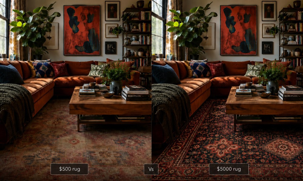
The $500 vs $5,000 Rug: An Honest Side-by-Side That No Brand Will Show You
Why do some rugs cost ten times more than others? This honest side-by-side looks at what actually separates a $500 rug from a $5,000 one: knot density, fiber quality, pile depth, and finishing. No brand bias, no marketing language. Just a clear breakdown to help you decide which one is worth it for your space and budget.
Read Article →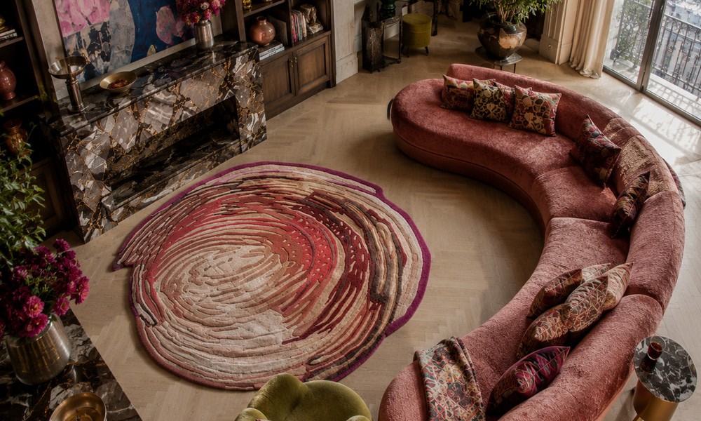
-
14 July 2026
- ∙
-
13 Min Read
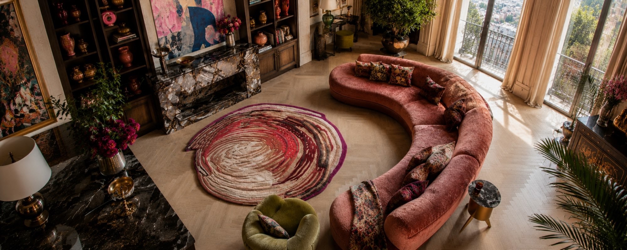
3D Rugs and Sculpted Pile: The Tactile Design Trend Redefining Floors in 2026
The rug used to finish a room. Now it starts one. 3D rugs and sculpted piles are bringing real depth and tactile texture to interiors, from hand knotted relief patterns to optical illusion designs that stop you mid-step. This is what the trend is, why it matters, and how to buy it well.
Read Article →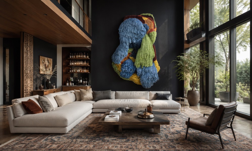
-
10 July 2026
- ∙
-
10 Min Read
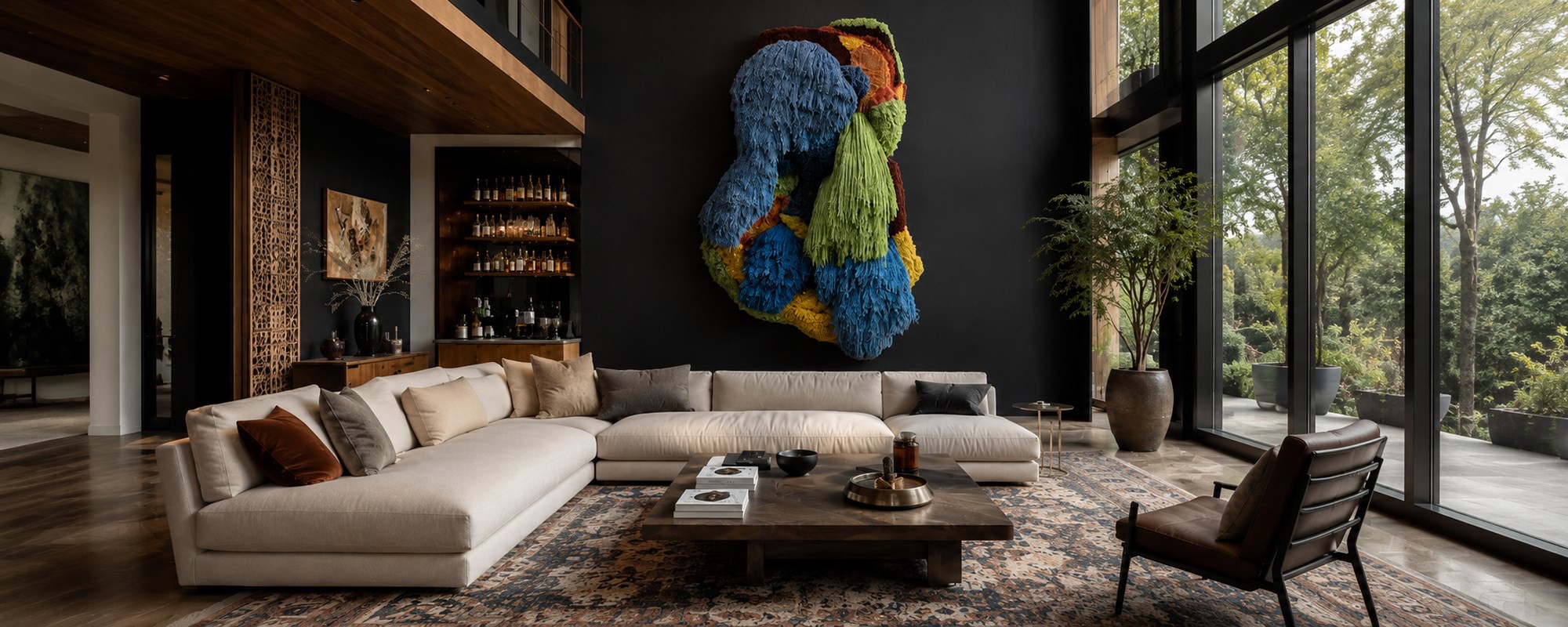
How to Pair Indian Wall Art with the Right Rug Pattern: A Room-by-Room Guide
Choosing the right rug to go with your Indian wall art does not have to be guesswork. This guide breaks it down room by room, from the living room to the bathroom and outdoor spaces. Learn how to match colors, patterns, and scale so your wall art and rug always feel like they belong together.
Read Article →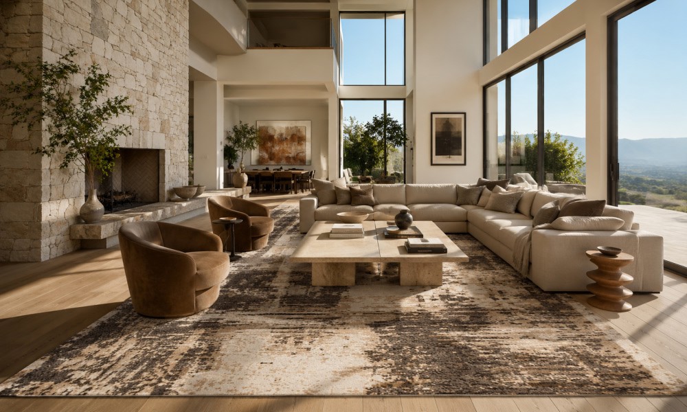
-
07 July 2026
- ∙
-
9 Min Read
How to Tell If a Rug Is Handmade: 7 Signs Experts Look For (Abrash Is One of Them)
Wondering how to know if a rug is handmade? Get an overview of 7 key characteristics that will help you identify if a rug is truly handmade and learn about its differences compared to machine-made rugs, and why they do not lose their value. Here is what to keep in mind when buying a handmade rug.
Read Article →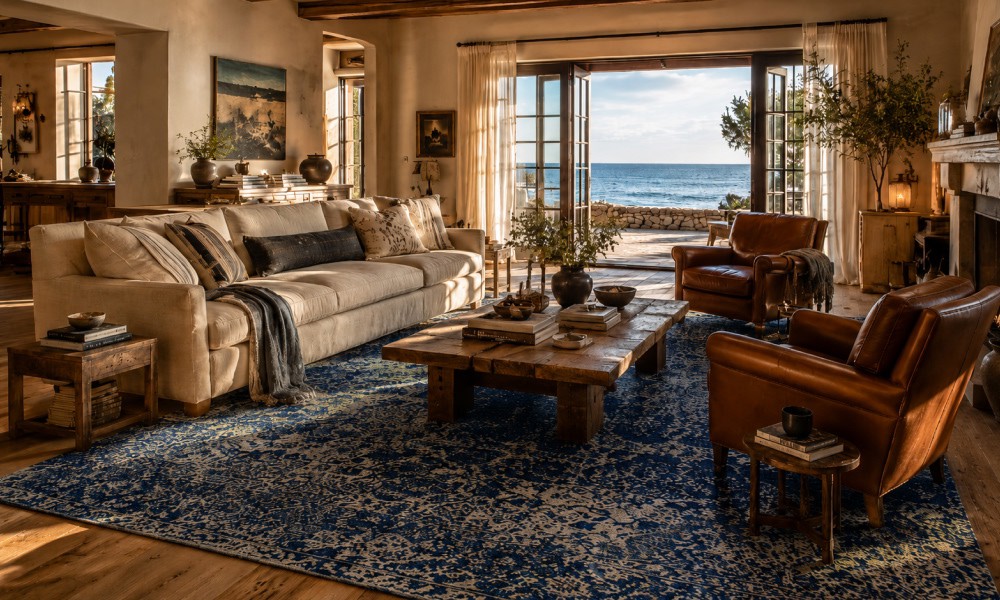
-
04 July 2026
- ∙
-
8 Min Read
Coastal Grandmother Is Evolving: The 2026 "Coastal Heritage" Aesthetic and the Rugs That Define It
The coastal grandmother design is progressing into something new and exciting by 2026. Coastal Heritage introduces texture, craftsmanship, and handmade elements to this popular design style. Here are the various rug types, colors, and decorating ideas to know about this classic coastal design trend.
Read Article →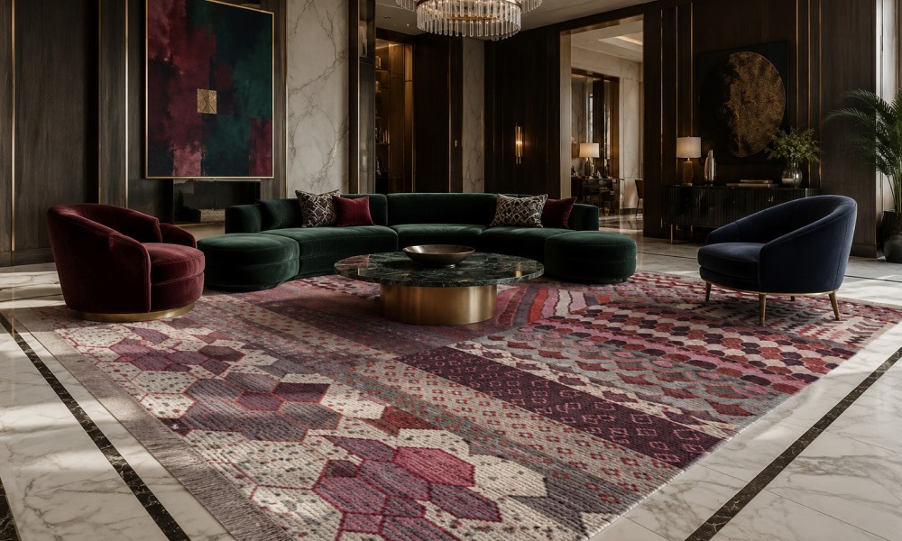
-
22 June 2026
- ∙
-
6 Min Read
Why Top Interior Designers are Switching to Indian Handmade Rugs
High-end interior designers have begun using handmade carpets from India in place of machine-made carpets to enhance their design portfolios and ensure product longevity. The following guide will help you understand why design professionals prefer Jaipur Rugs for creating customized, ethically produced wool-and-bamboo-silk carpet designs for luxurious homes.
Read Article →