You are on our International website. Please select your region to see content specific for your location





 Profile
 Orders
 Wishlist
 Change Password
 Logout


Latest Blogs
ideas and inspiration
What Color Is Chartreuse? The Internet Can’t Decide And Homes Suddenly Want It
- 27 May 2026
- |
- 7 Min Read
- |
- By Jaipur Rugs
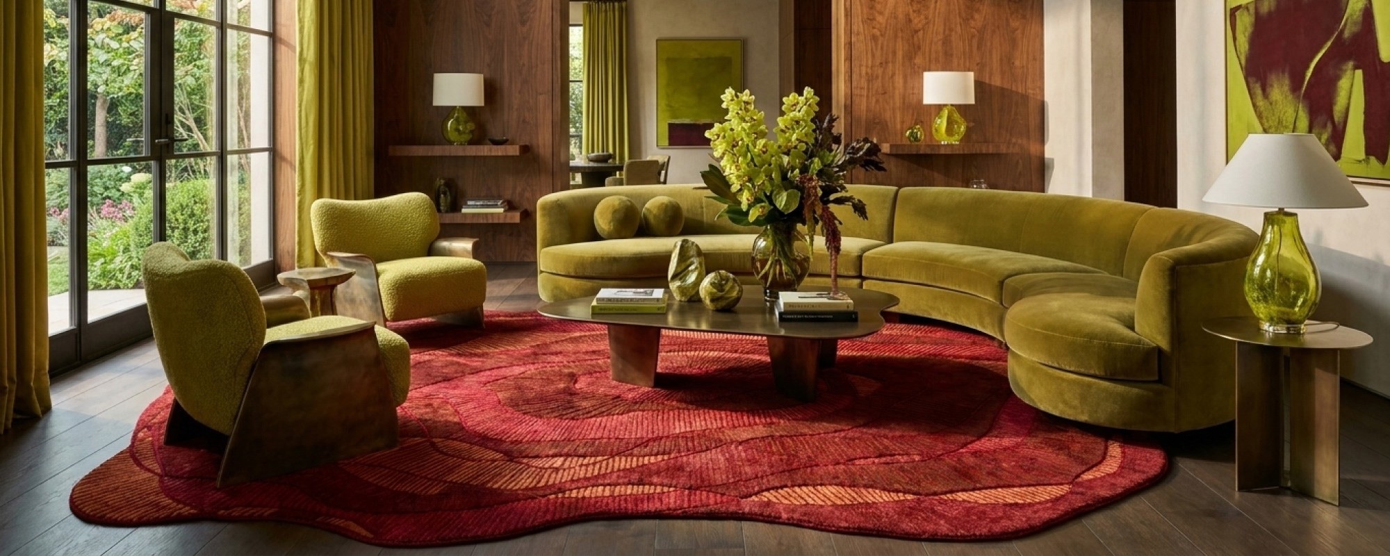
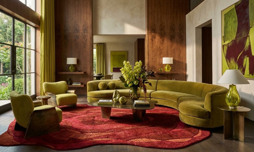
For years, the internet flattened homes into beige smoothies with black faucets. Then, chartreuse color arrived like visual caffeine. This acidic yellow-green shade is what every interior designer is raving about right now. But why does this “acidic” color suddenly work with modern interiors? Keep on reading to find out exactly why!
Nobody confidently identifies chartreuse the first time.
People squint at it.
Argue about it.
Call it green. Then yellow. Then “that expensive tennis-ball color designers keep using lately.”
Meanwhile, chartreuse color just sits there, unbothered, making beige rooms question their entire personality.
And maybe that confusion is exactly why chartreuse interiors suddenly feel so addictive.
Because after years of homes looking like softly lit oat milk, the 70s hit color chartreuse arrived carrying danger, personality, and just enough chaos to make people feel awake again.
Not chaotic enough to ruin a room.
Just enough to stop it from looking dead behind the eyes.
What Color Is Chartreuse? Which Side Of The Drama Did You Meet
Chartreuse is a yellow-green color that lives directly between green and yellow on the color wheel. That sounds simple until you actually see it in a room.
Then things get complicated fast.
Morning light pulls out the green.
Lamp light drags out the yellow.
Next to walnut wood, it looks earthy.
Next to chrome, it suddenly behaves like futuristic fruit.
This is why people keep searching what color is chartreuse like the internet owes them emotional closure.
Because chartreuse refuses to stay in one lane.
Some versions feel mossy and vintage.
Others look like a lime won an architecture award.
And unlike flatter colors, chartreuse changes mood depending on:
-
Texture
-
Lighting
-
Surrounding materials
-
Fabric finish
-
Room temperature
-
Probably your current life decisions
A chartreuse velvet chair looks completely different from a chartreuse handmade rug in premium wool. One flirts. The other anchors the room like it pays the rent.
Is Chartreuse Green Or Yellow? Yes.
This is the part that breaks people.
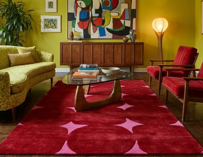
Chartreuse is a yellow-green color that sits directly between green and yellow on the color wheel. But visually, it keeps switching sides like a political scandal.
Green chartreuse appears earthier and deeper, while yellow chartreuse feels brighter and more electric.
Let us further break it down for you:
Green Chartreuse
-
Cooler. Richer. Earthier.
-
Feels incredible with:
-
Walnut wood
-
Charcoal walls
-
Vintage rugs
-
Aged brass
-
Deep olive tones
Green chartreuse is the version that walks into a room carrying jazz records and opinions about lighting.
Yellow Chartreuse
Sharper. Brighter. More electric.
Works beautifully with:
-
Light blue
-
Dusty pink
-
Glossy finishes
-
Red accents
-
Contemporary interiors
Yellow chartreuse behaves like it already knows where the afterparty is.
And this dual identity is exactly why chartreuse color interior design feels alive rather than staged. Your eye never fully settles around it. The color keeps moving.
Most neutral palettes soothe the eye.
Chartreuse color pokes it with a stick.
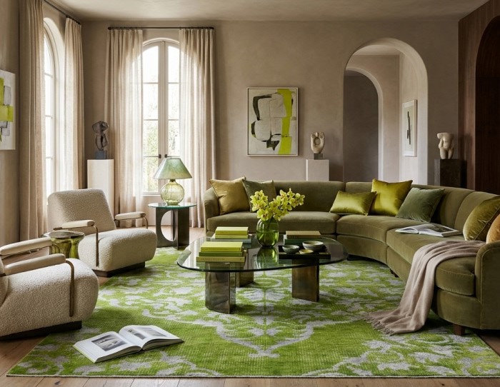
Why Is Chartreuse Color Suddenly Everywhere In Interiors?
Because the internet accidentally turned homes into luxury yogurt.
Everything became:
-
Beige
-
Curved
-
Cream
-
Bouclé
-
Emotionally cautious
At some point, interior experts realized that luxury living rooms looked as if they were afraid to have opinions.
Now, designer interiors are swinging back toward:
-
Layered color stories
-
Collectible furniture
-
Richer pigments
-
Expressive rooms
-
Vintage influence
-
Emotionally charged spaces
Not louder necessarily. Just more human.
That shift opened the door for chartreuse decor.
Because chartreuse does something most safe neutrals cannot:
It creates tension.
Good tension.
The kind that makes someone walk into your home and immediately ask, “Wait… what is that color?”
And honestly? That reaction matters.
The most memorable homes are rarely the most perfect ones.
They are the ones that interrupt autopilot.
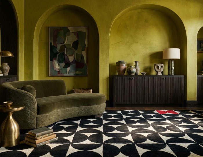
What Color Family Is Chartreuse?
People search what color family is chartreuse, expecting a clean answer. Unfortunately, chartreuse color behaves more like a mood swing with excellent styling.
It technically belongs to the yellow-green family, but emotionally it splits into multiple personalities depending on saturation.
Muted chartreuse feels vintage and expensive.
Bright chartreuse feels energetic and slightly rebellious.
Antique rugs in this color feel collected over time instead of purchased during a “refresh your space” sale weekend.
This flexibility is why chartreuse color ideas keep expanding beyond accent pillows and tiny decor objects.
Designers are now using chartreuse in:
-
Hand knotted rugs
-
Moody libraries
-
Color-drenched rooms
-
Boutique-hotel interiors
-
Transitional spaces
-
Sculptural furniture
Because chartreuse photographs beautifully without flattening into visual mush online.
And in this 4D era, colors that create immediate visual curiosity win attention faster than safe neutrals ever will.
What Colors Go With Chartreuse?
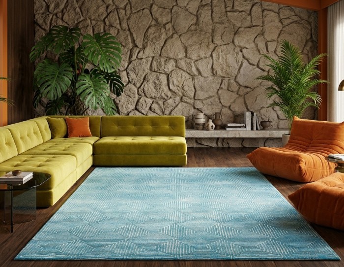
Chartreuse works best when paired with colors that either calm its intensity or sharpen its contrast. That flexibility is exactly why chartreuse interiors are suddenly appearing in living rooms, boutique hotels, vintage-inspired homes, and collectible design spaces.
Here are the best combinations to go for:
Chartreuse and Cream
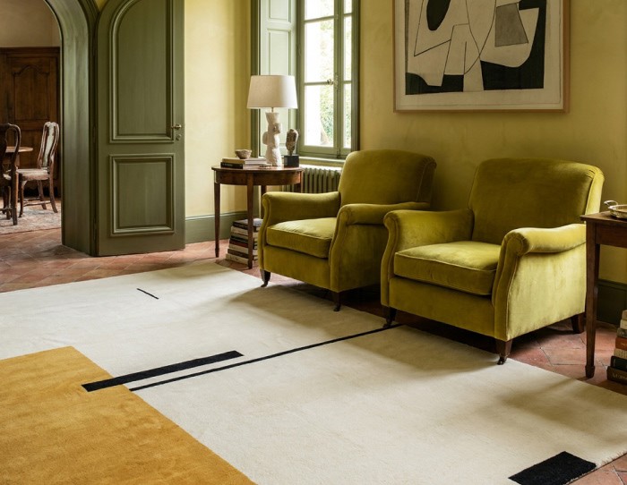
Cream softens chartreuse without muting it completely. A chartreuse area rug under cream seating creates layered contrast while keeping the room open, airy, and visually balanced.
Chartreuse and Light Blue
One of the strongest current pairings in chartreuse interior design. Decorating with a chartreuse color modern rug and light blue feels fresh because blue cools chartreuse’s brightness, while chartreuse prevents pale blue spaces from looking flat.
Chartreuse and Dusty Pink
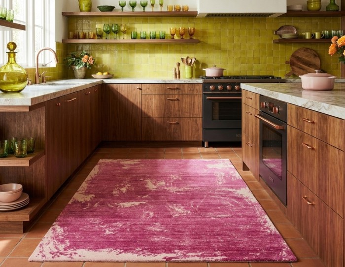
Muted blush, clay pink, and cosmetic-toned pinks make chartreuse feel richer and more fashion-forward. This combination works especially well in velvet, hand knotted, and textured natural fiber rugs.
Chartreuse and Deep Red
Oxblood, burgundy, rust, and wine tones create cinematic depth with chartreuse. The pairing feels strongest when balanced with walnut wood, distressed rugs, and moodier lighting.
Chartreuse and Greige
Greige is a mix of beige and grey colors, which is the safest entry point for people experimenting with chartreuse decor. It absorbs some of the color’s intensity while still allowing chartreuse to create movement inside neutral rooms.
Chartreuse and Charcoal
Charcoal creates a sharp, graphic contrast that makes chartreuse glow instead of overwhelming. This combination works especially well in modern apartments, tribal rugs, and darker contemporary interiors.
How Do You Decorate With Chartreuse Rugs Without Regretting It Later?
Simple.
Do not build the entire room around chartreuse. Let chartreuse interrupt the room instead.
In living rooms:
-
Pair chartreuse rugs with cream upholstery
-
Add walnut or oak furniture
-
Keep larger surfaces calmer
In bedrooms:
-
Choose muted green chartreuse rugs
-
Combine with layered linen and softer lighting
In hallways:
-
Use chartreuse runner rugs to wake up dead space instantly
The trick is balance.
Chartreuse should feel like an unexpected guest with incredible stories.
Not a motivational speaker screaming across the entire room.
Summing Up..
People want spaces that feel specific.
Chartreuse delivers that instantly.
It catches light strangely.
It changes mood constantly.
It creates an emotional reaction instead of passive approval.
And maybe that is why the internet still cannot fully agree on what color chartreuse actually is.
The color refuses to behave like background decoration.
Which, frankly, is exactly what makes it unforgettable.
We will be back with another blog soon.
Till then, stay tuned and explore Jaipur Rugs!
Frequently Asked Questions
What Color Is Chartreuse?
Chartreuse is a vivid yellow-green color that sits between green and yellow on the color wheel. Greener chartreuse feels earthier and moodier, while yellower chartreuse appears brighter and more acidic. Its constantly shifting appearance is exactly why chartreuse interiors and rugs feel more visually alive than flat neutral palettes.
Is Chartreuse Green Or Yellow?
Both. Chartreuse belongs to the yellow-green color family, which is why some shades appear greener while others lean intensely yellow. Lighting, textures, and surrounding colors dramatically change how chartreuse looks inside interiors.
What Color Goes With Chartreuse?
Chartreuse works best with cream, walnut wood, charcoal, dusty pink, burgundy, greige, and light blue. Cream softens its intensity, charcoal sharpens contrast, while muted blues and wood tones make chartreuse feel more balanced and livable inside interiors.
What Color Season Is Chartreuse?
Chartreuse is most commonly associated with spring because of its fresh yellow-green vibrancy, but deeper green chartreuse shades also work beautifully in autumn-inspired interiors with walnut wood, rust tones, and vintage textures.
What Is The Closest Color To Chartreuse?
Lime green is usually considered the closest color to chartreuse, but chartreuse contains more yellow undertones and appears richer and warmer. Some chartreuse shades can also resemble acid green, citron, or yellow-lime, depending on saturation and lighting.
Is Chartreuse More Yellow Or Green?
Chartreuse sits directly between yellow and green, but most modern chartreuse shades lean slightly more yellow. Green chartreuse appears deeper and earthier, while yellow chartreuse feels brighter, sharper, and more electric.
Why Is Chartreuse Trending In Interiors?
Chartreuse is trending because homes are moving away from overly safe beige and grey palettes. Designers are using chartreuse color, furniture, and accents to create rooms that feel more expressive, layered, and emotionally memorable without becoming fully maximalist.
What Colors Go With Chartreuse?
Chartreuse pairs especially well with cream, walnut wood, charcoal, dusty pink, burgundy, greige, and light blue. Softer tones calm chartreuse, while darker tones create sharper contrast and depth.
Is Chartreuse A Good Color For Living Rooms?
Yes. Chartreuse works especially well in living rooms because it creates movement and visual energy without needing excessive decoration. Most designers use chartreuse in rugs, pillows, wall art, or accent seating rather than on entire walls.
How Do You Decorate With Chartreuse Rugs?
Chartreuse rugs work best inside neutral interiors with cream upholstery, walnut wood, charcoal accents, or muted blue tones. Vintage and distressed chartreuse rugs feel softer and easier to style than highly saturated modern versions


Pic Credits
Jaipur rugs / Abil Dase
Share
-
 Facebook
-
 Twitter
-
 Email
Email
Related Posts
-
15 July 2026
- ∙
-
8 Min Read
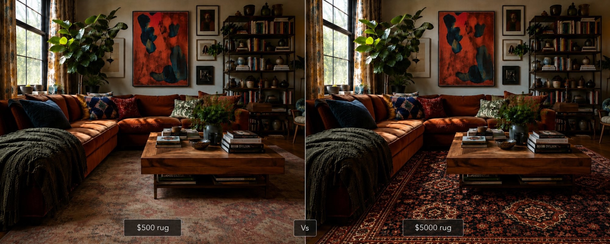
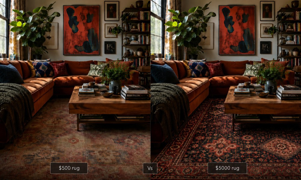
The $500 vs $5,000 Rug: An Honest Side-by-Side That No Brand Will Show You
Why do some rugs cost ten times more than others? This honest side-by-side looks at what actually separates a $500 rug from a $5,000 one: knot density, fiber quality, pile depth, and finishing. No brand bias, no marketing language. Just a clear breakdown to help you decide which one is worth it for your space and budget.
Read Article →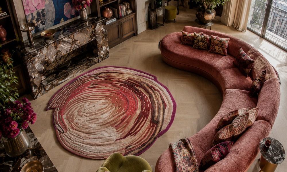
-
14 July 2026
- ∙
-
13 Min Read
3D Rugs and Sculpted Pile: The Tactile Design Trend Redefining Floors in 2026
The rug used to finish a room. Now it starts one. 3D rugs and sculpted piles are bringing real depth and tactile texture to interiors, from hand knotted relief patterns to optical illusion designs that stop you mid-step. This is what the trend is, why it matters, and how to buy it well.
Read Article →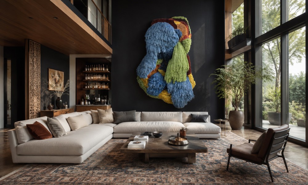
-
10 July 2026
- ∙
-
10 Min Read
How to Pair Indian Wall Art with the Right Rug Pattern: A Room-by-Room Guide
Choosing the right rug to go with your Indian wall art does not have to be guesswork. This guide breaks it down room by room, from the living room to the bathroom and outdoor spaces. Learn how to match colors, patterns, and scale so your wall art and rug always feel like they belong together.
Read Article →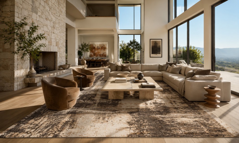
-
07 July 2026
- ∙
-
9 Min Read
How to Tell If a Rug Is Handmade: 7 Signs Experts Look For (Abrash Is One of Them)
Wondering how to know if a rug is handmade? Get an overview of 7 key characteristics that will help you identify if a rug is truly handmade and learn about its differences compared to machine-made rugs, and why they do not lose their value. Here is what to keep in mind when buying a handmade rug.
Read Article →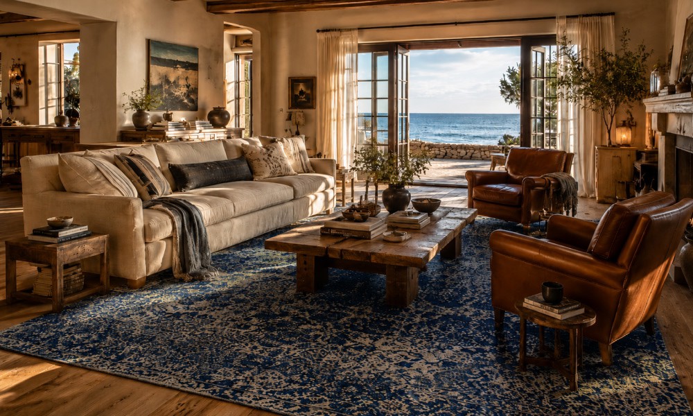
-
04 July 2026
- ∙
-
8 Min Read
Coastal Grandmother Is Evolving: The 2026 "Coastal Heritage" Aesthetic and the Rugs That Define It
The coastal grandmother design is progressing into something new and exciting by 2026. Coastal Heritage introduces texture, craftsmanship, and handmade elements to this popular design style. Here are the various rug types, colors, and decorating ideas to know about this classic coastal design trend.
Read Article →
-
22 June 2026
- ∙
-
6 Min Read
Why Top Interior Designers are Switching to Indian Handmade Rugs
High-end interior designers have begun using handmade carpets from India in place of machine-made carpets to enhance their design portfolios and ensure product longevity. The following guide will help you understand why design professionals prefer Jaipur Rugs for creating customized, ethically produced wool-and-bamboo-silk carpet designs for luxurious homes.
Read Article →