You are on our International website. Please select your region to see content specific for your location


LATEST BLOGS
Neutrals Are Failing — These 3 Earthy Colors Work Far Better
- 16 April 2026
- 6 Min Read
- By Jaipur Rugs
Neutrals feel like the safe choice until the room starts looking flat and disconnected. That’s where earthy rug colors take over. Terracotta, ochre, and mocha don’t just add colour, they correct balance, manage light, and hold up in daily use. Scroll down to see exactly which colour works in which room, and the one mistake that ruins the entire effect.
Somewhere between the all-grey apartment era and the overcorrection into dopamine decor, three colours walked back into the room as they had never left. Terracotta. Ochre. Mocha. Not new. Not invented by an algorithm. Just earthy tones that spent 40,000 years being correct and are now finally getting the floor space they deserve.
Your Brain Already Loves Earthy Tones: Here Is the Science It Cannot Override
Earthy tones don’t just “look good.” They register as safe because the human brain evolved around soil, clay, and vegetation. When a space feels grounded, it is not a preference; it is a neurological response.
What feels like taste is actually pattern recognition your brain has learned over time:
-
Biophilic design research identifies earth-spectrum colours as one of fourteen patterns that can reduce cortisol levels, which is why earthy tones feel calming.
-
A terracotta modern rug functions beyond decoration because it introduces a biologically familiar colour associated with natural ground surfaces.
-
Warm earthy tones absorb and scatter light differently than cool tones, which helps reduce visual fatigue in bright, sunlit interiors.
-
Forecasting bodies like WGSN, Pantone Color Institute, and Pinterest Predicts have consistently identified earthy tones as a long-term design shift, not a short-lived trend.
-
Terracotta appears grounded because its pigment comes from iron oxide and clay minerals, giving it a direct geological origin.
-
Warm tones placed on the floor create visual gravity, stabilizing the room, while the same tones on walls can make spaces feel smaller.
You are not choosing earthy tones because they look better. You are choosing them because your brain recognizes them as stable, familiar, and easier to live with.
How to Use Earthy Style Without Your Room Looking Like a Mud Bath?
Earthy tones don’t fail because of colour. They fail because of an imbalance. The risk isn’t using terracotta or ochre; it’s using them without structure.
Here’s the framework that keeps earthy style controlled, not overwhelming:
-
Use the 60-30-10 rule: 60% earthy tone through the handmade rug, 30% neutral on walls and upholstery, and 10% accents through decor. Placing the dominant colour on the floor grounds the room without making it feel enclosed.
-
For outdoor spaces, the area rug should be the darkest element against a lighter surface to anchor properly.On dark flooring, a lighter, earthy tone works better to avoid visual heaviness.
-
Geometric rug patterns in earthy tones create structure and make modern compact homes feel big.
-
Organic or abstract rug patterns create a relaxed feel and work better in layered interiors.
-
Pairing earthy tones with highly saturated colours creates visual conflict and breaks cohesion.
-
Every earthy tone color in Jaipur Rugs uses natural or low-impact dyes. The iron-oxide base of the terracotta wool carpet responds to natural light in ways no screen preview can capture, which is why it reads richer in-room than in any product photo.
Earthy style works when contrast, balance, and placement are right. Without that, even the best colour choices fall flat.
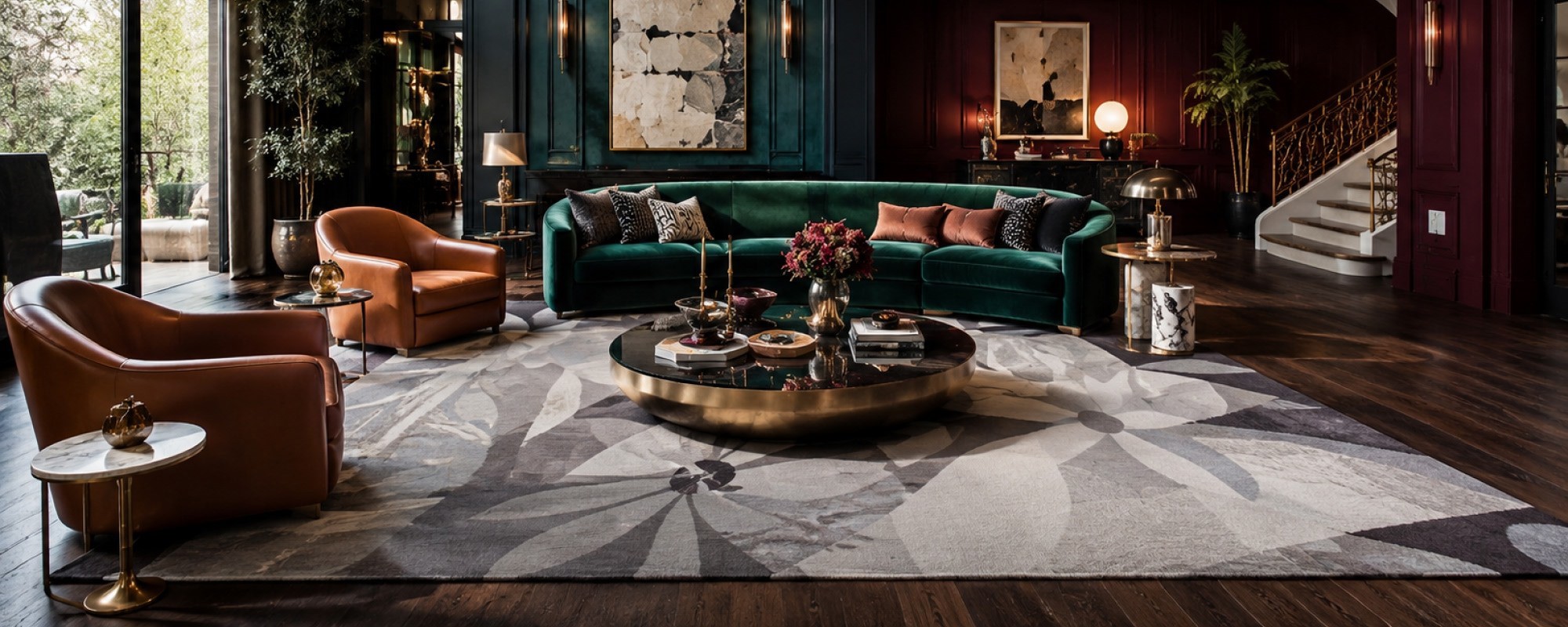
The Best Earthy Rug Colors for Every Room
Earthy tones are not a universal prescription. Terracotta does not belong in every room at the same saturation. The color is only half the decision. The room is the other half.
Here is every major room, the earthy tone that works hardest in it, and the single mistake that undoes the whole thing.
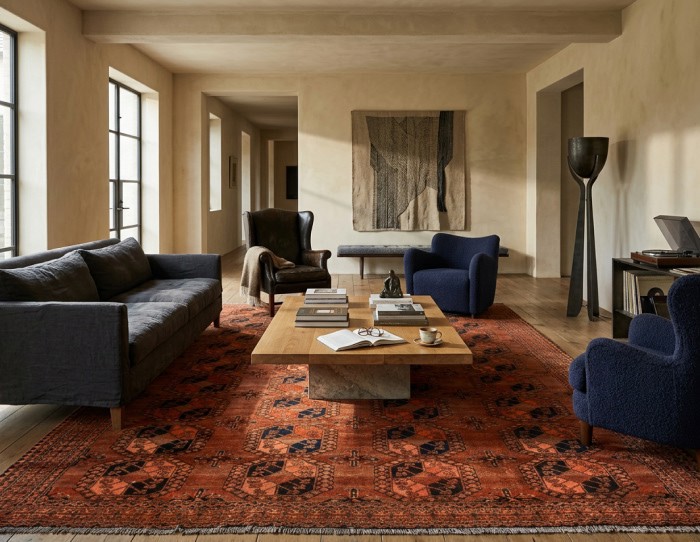
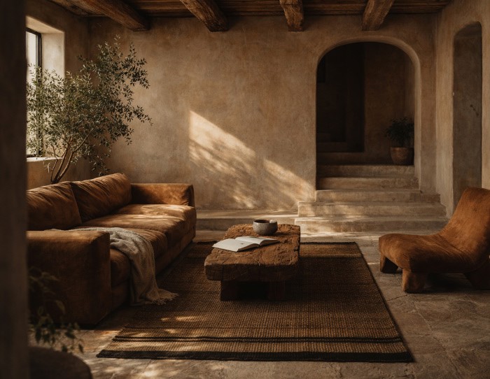
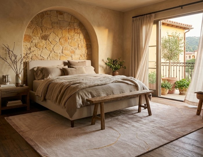
Bedroom: Mocha
The bedroom does not need the visual energy that terracotta carries. Mocha, the deeper, browner end of the earthy spectrum, introduces warmth without the activation. A mocha color geometric or traditional rug beside and beneath the bed creates a tonal envelope, especially effective in bedrooms with white or plaster-finish walls, where the contrast is soft rather than punchy.
The mistake: matching the mocha rug to the wood floor tone. When the rug and the floor are the same depth of brown, the rug disappears. The floor needs to read lighter or darker than the rug for the earthy tone to do anything at all. Pale oak and mocha work. Dark walnut and mocha compete.
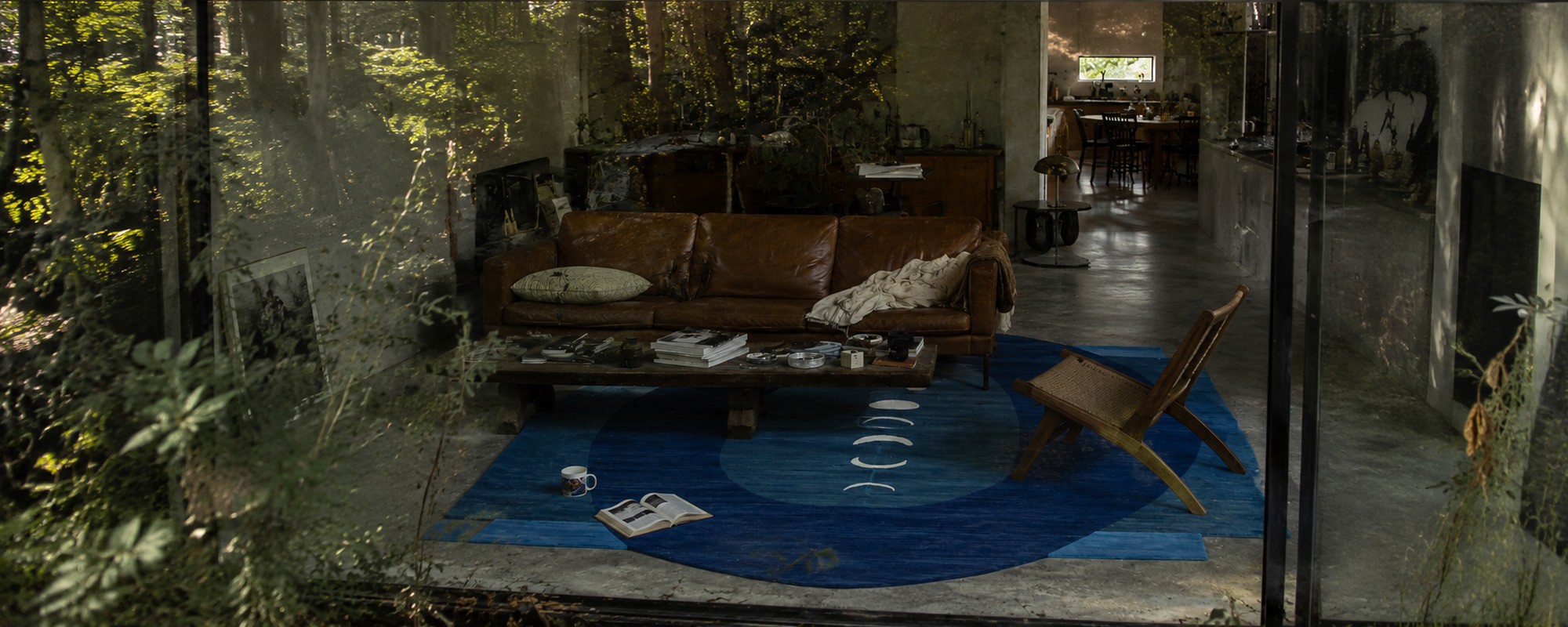
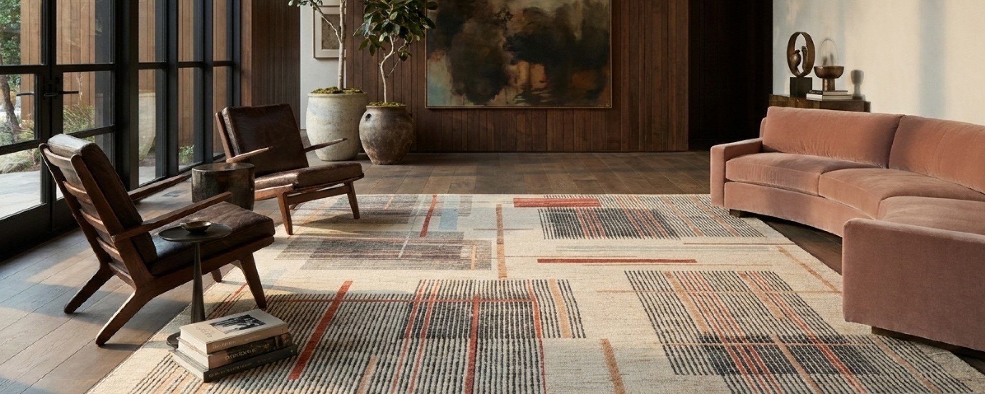
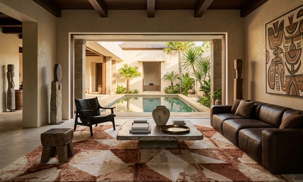
Living Room: Terracotta
Terracotta is the most spatially confident of the three. In a living room, where the large rug anchors seating, defines zones, and absorbs the most visual traffic, terracotta holds its weight. A terracotta handmade cotton rug under a low sofa in cream or undyed linen creates the kind of grounded warmth that grey rugs simply cannot manufacture.
The mistake: sizing down to avoid commitment. A terracotta color Persian rug that does not reach under the front legs of the sofa reads as an afterthought. Earthy tones need floor coverage to function. A rug that is too small turns a grounding color into a floating one.
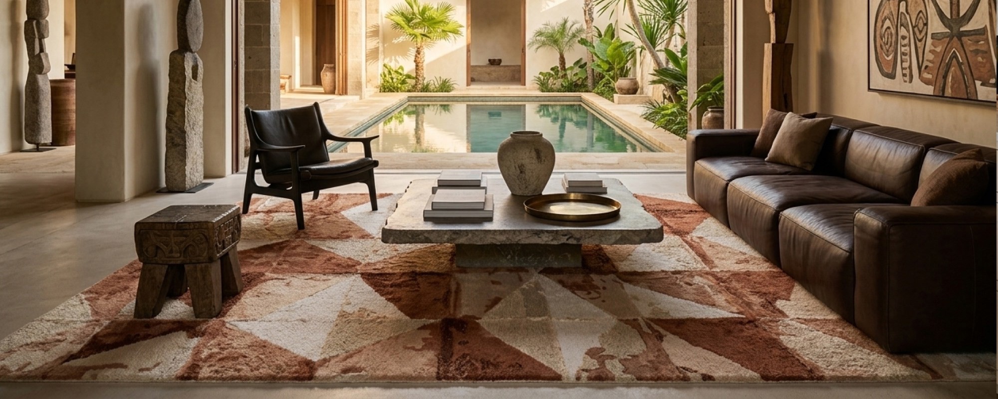
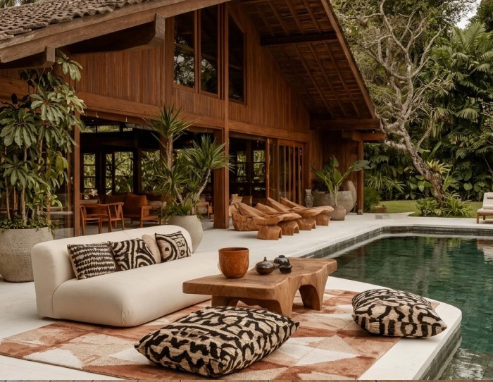
Outdoor and Terrace: Terracotta
A terracotta outdoor rug does on a terrace what it does on any floor: it grounds from below. Against light limestone, pale concrete, or washed timber decking, terracotta creates a defining anchor that makes outdoor furniture arrangements read as intentional rather than provisional.
The mistake: placing a terracotta outdoor polyester rug on dark slate or charcoal composite decking. The area rug needs to be the darkest element against a lighter ground surface for earthy tones to anchor correctly. On dark decking, shift to ochre, warm sand, or a lighter clay tone, or the floor level becomes one continuous dark mass.
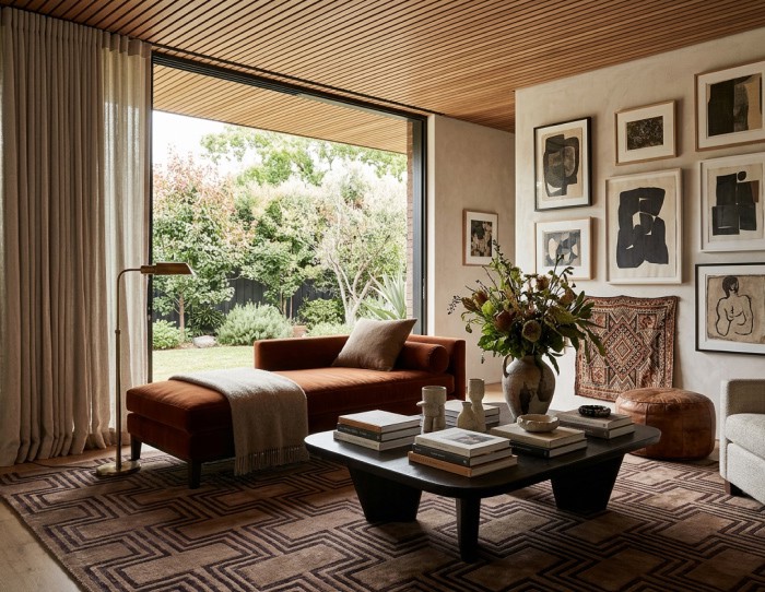
Dining Room: Ochre
Ochre is the most underused of the three in dining rooms, which is exactly why it works. Where terracotta reads robust, and mocha reads quiet, ochre reads alive, warm, golden, slightly mineral. Under a dining table, ochre earns its place because it reflects the warmth of overhead pendant lighting downward into the room, creating a visual warmth at meal level that cooler colors shut down entirely.
The mistake: choosing an ochre rug with too much yellow. True ochre sits between gold and clay. When the yellow tips past the clay, the rug starts fighting with wood furniture and brass hardware instead of pulling them together. If the ochre in your room looks acidic in natural light, it is not earthy enough.
Summing Up..
You don’t need another “nice-looking” designer rug. You need one that fixes your space.
Earthy colors aren’t trending because they look good in photos. They are taking over because they solve what most modern rugs fail at, making a room feel grounded, reducing visual chaos, and holding up in real life.
This isn’t about playing with colour.
It’s about choosing an area rug that actually works once you live with it.
We will be back with another blog soon.
Till then, stay tuned and explore Jaipur Rugs!
FAQs
Are earthy tones a good choice for summer rugs?
Earthy tones are ideal for summer rugs. They absorb high-frequency light and reduce visual fatigue in sun-filled rooms. Ochre is the best performer under direct sunlight, while terracotta anchors shaded terraces and covered patios. Summer outdoor rugs in earthy colors bridge indoor and outdoor spaces naturally.
What earthy colors work best in a living room?
Mocha is the strongest living room anchor because it functions as a true neutral, grounding warm wood, cool linen, and dark leather without contrast tension. Layer a mocha brown rug with ochre accents and terracotta ceramics for a full, earthy tones palette that reads rich, not overwhelming.
What warm tone colors pair well with a terracotta area rug?
A terracotta area rug pairs with cream, undyed linen, olive green, warm white, and aged brass. These warm tone colors share a low-saturation language that supports an earthy style. Avoid yellow-green, electric blue, or high-saturation pink, they fight the earthy palette instead of serving it.


Pic Credits
Jaipur rugs / Abil Dase
Share
-
 Facebook
-
 Twitter
-
 Email
Email
Related posts
-
05 June 2026
-
7 Min Read
Best Rug for a Brown Leather Sofa: The Complete Colour Guide
Styling a brown leather couch requires balancing its heavy visual weight with the perfect floor covering. This guide explores how crisp neutrals brighten dark leather, cool blues and greens provide elegant contrast, and traditional patterns tie a room together. Learn to identify your sofa’s undertones and choose a rug that makes your living space feel balanced, open, and cohesive.
Read More >
-
02 June 2026
-
6 Min Read
What Color Bathroom Rug Goes With Green Walls? Best Pairings for Every Shade
Most people think a green bathroom succeeds or fails because of the shade of green they choose. Designers know better. The real difference usually appears at floor level. That's why two bathrooms with identical walls can feel completely different. One feels finished. The other feels like something is missing. More often than not, the answer comes down to the rug and the contrast it creates.
Read More >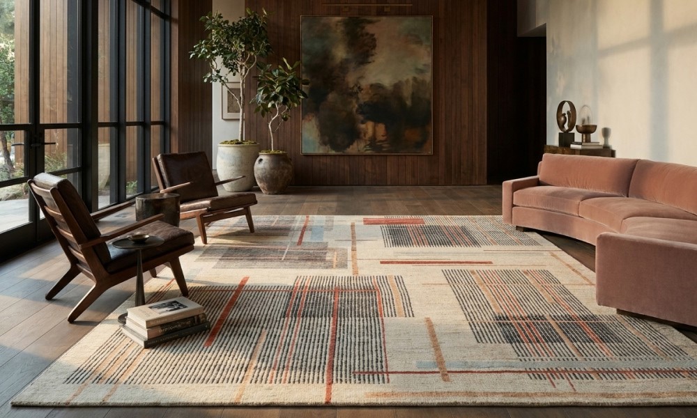
-
31 May 2026
-
4 Min Read
The End Of Sterile Minimalism: Meet The Blythe Collection
The most interesting interiors right now aren't becoming more decorated. They are becoming more distinctive. The Blythe Rug Collection captures that shift through architectural geometry, abstract compositions, and richly textured, hand knotted wool rugs that resist the sameness that dominates modern interiors. Read more to see how the Blythe collection offers a glimpse into where contemporary design is already heading.
Read More >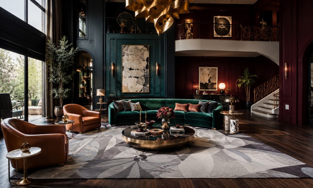
-
30 May 2026
-
8 Min Read
Not All Wool Is the Same: The Rug Buyer's Guide to New Zealand, Merino, Himalayan, and Hand-Spun Wool
Choosing the right floor covering requires understanding your material's origin. While New Zealand fibers offer a pristine, vibrant canvas for modern spaces, Merino provides unmatched barefoot softness. For high-traffic areas, lanolin-rich Himalayan and resilient hand-spun Afghan wools offer the ultimate heirloom durability. Explore how these distinct textures transform your interior layout.
Read More >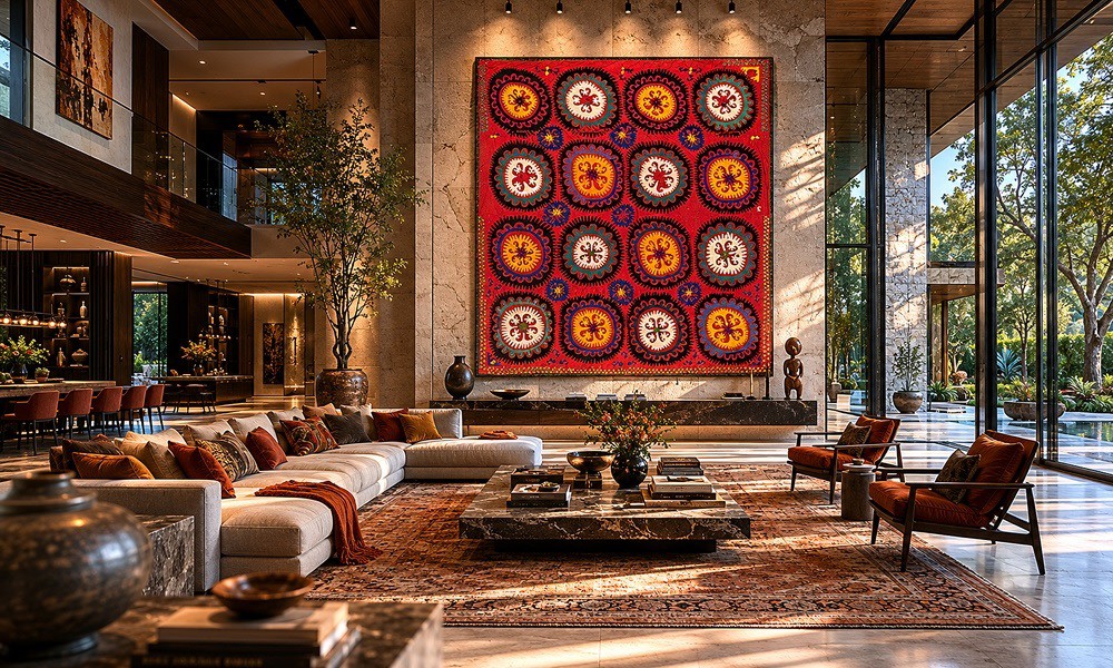
-
23 May 2026
-
7 Min Read
Suzani Fabrics 2026: Hand-Embroidered Patterns & Trends for Luxury Interiors
Hand-embroidered suzani fabrics are leading the 2026 luxury heritage revival. This guide defines traditional Uzbek motifs and offers expert styling tips for bohemian maximalism and eclectic decor. Learn to balance these bold, tactile tapestries by grounding your space with high-quality, textured wool rugs that seamlessly blend global craftsmanship with modern, sophisticated interior design.
Read More >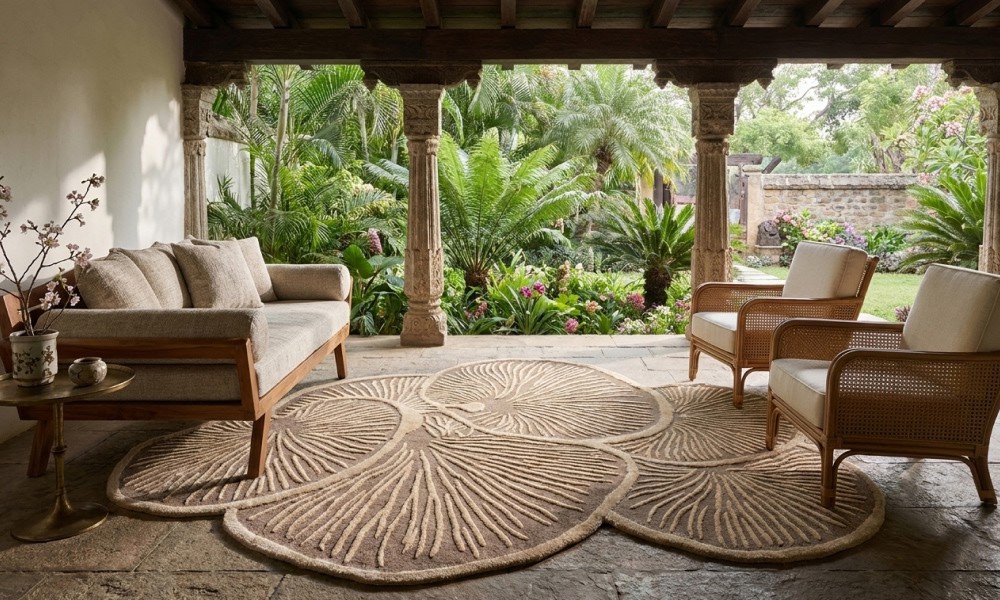
-
26 May 2026
-
6 Min Read
How Wabi Sabi Style Embraces Imperfection Like Never Before?
Perfect interiors are starting to feel like showroom screenshots with no pulse. Wabi sabi interrupts that perfection spiral with imperfect handmade rugs, uneven textures, faded surfaces, and rooms that feel beautifully unresolved. As modern interiors become visually exhausting, this Japanese design ethos is making rawness, irregularity, and human imperfection magnetic again. Keep reading before your home starts looking painfully overfinished.
Read More >